Cockpit: "Property Correlations"
Discover correlations between numerical variables (=properties) and investigate correlations in detail.
Pro This cockpit is only available in Visplore Professional.
Overview
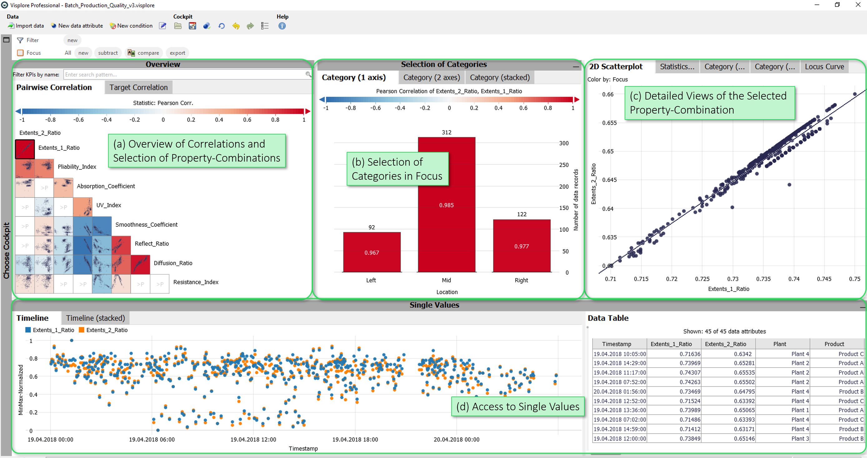
- Overview of Correlations and Selection of Property-Combinations: A matrix showing pairwise correlations of properties (first view tab), and a list of properties correlated with one chosen target variable (second view tab). In these views, you select the properties shown in detail in the rest of the cockpit.
- Selection of Categories in Focus: Here, you define the current focus of the analysis. By selecting one or more categories, you can restrict the analysis to a subset of the data, such as a specific location or plant.
- Detailed Views of the selected Property-Combination: These views show details of the selected property combination (e.g. a 2D scatterplot view).
- Access to Single Values: This group of views allows access to single values. The "Timeline" time series view shows the currently selected properties. The table shows the values of the measured values currently selected in the views.
Starting the cockpit - assigning semantic roles
The following roles can be given to data attibutes in this cockpit. Use the  icon in the toolbar to adjust them.
- Time axis: This role can be given to a data attribute defining a temporal ordering of the data records. Can be time stamps, or values. It will be used to define the temporal context for all variables, e.g. the times of measurement, consumption, production, etc. If the role is assigned to a data attribute of date/time type, periods like 'Month', 'Hour' etc. are extracted and available for defining filters, and categorical plots like bar charts.
- Category: Some views aggregate values by categories (e.g. per day of week, per month, etc.). When this role is assigned to a categorical data attribute, its categories are available for such aggregations. The role can also be assigned to numerical data attributes, which results in one category per distinct value of that attribute (e.g. different states encoded as 0 or 1). If the role is given to a data attribute of date/time type, periods like 'Month', 'Hour' etc. are extracted and available for defining filters, and categorical plots like bar charts.
- Property: Numerical data attributes with this role can be inspected in the cockpit and are considered in calculations. In case you want to exclude a variable from all considerations, simply do not assign this role to it.
- Upper limit: A numerical data attribute with this role defines an upper limit for a property. It will be shown along with the referenced data attribute in timeline views and histograms. Moreover, it is used in process statistics like tolerance violations.
- Lower limit: analogous to Upper limit, but for lower limits.
- Setpoint: analogous to Upper limit, but numerical data attributes with this role represent a setpoint (=desired state) for the reference data attribute. Data attributes with this role are additionally displayed in views.
- Curves: This optional role is for data attributes that hold one curve per data record, e.g. a short time series per production batch, or a spectrum
Overview of Correlations
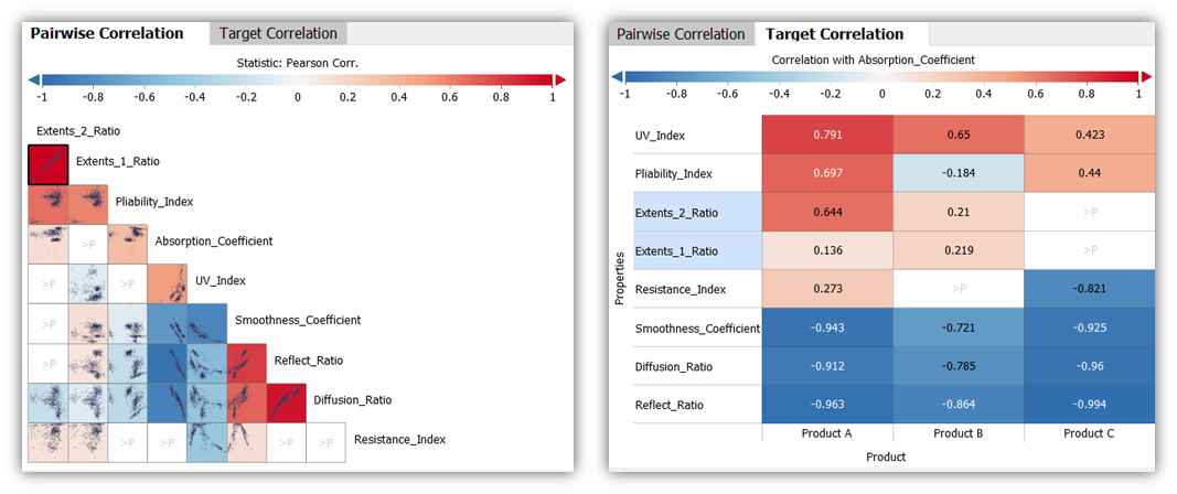
The "Pairwise Correlation" view is a half-matrix displaying the correlation for each pair-wise combination of properties.
- Clicking on a matrix cell (i.e., a pair of properties) shows the corresponding pair of properties in all other views.
- The color of a cell shows the Pearson correlation of the pair (red = positive, blue = negative, white = independent).
- The order of the property pairs in the matrix is determined by their correlation value. The combination with the highest correlation is shown on top.
- The set of displayed properties can be configured by typing a text filter in the "Filter" field above the view, or by clicking the view title, "Pairwise Correlation", then "Select properties".
The "Target Correlation" view shows a list of all properties, each Pearson-correlated with one target variable.
- Clicking the name of a property shows it, paired with the target variable, in all other views.
- The target variable can be selected by clicking the label above the color legend (e.g. "Correlation with Absorption Coefficient" in the image above).
- The list of properties correlated with the target can be filtered by the "Filter KPIs by name" field above the view.
- Initially, the correlation with every property is compared for different categories, like months or products. These are the columns in the right image above. This is useful for finding differences in correlation behaviour. To change the categories, or show only the overall correlation per variable, click the x-axis label (here: "Product"), then "Switch category", or "Remove".
- The properties are initially sorted by overall correlation with the target (disregarding categories), from strong positive at the top, to strong negative, at the bottom. Alternatively, click the y-axis label "Properties", and choose "Order by" for further options. For example, "Variance" brings variables to the top, where the correlation varies much across the categories on the x-axis.
Selection of Categories in Focus
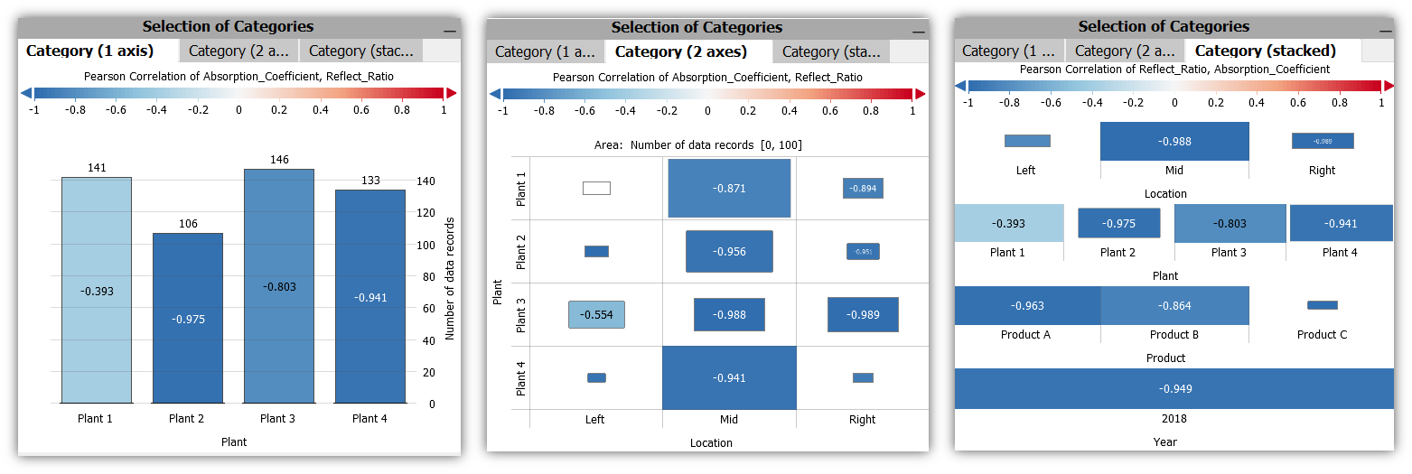
In these views, the correlation of the selected property-combination is shown for (combinations of) categories.
The color encodes the correlation of the two properties in the respective category. The length of the bars or the size of the boxes indicates the number of data records in each category.
The views can be used to perform selections of categories by clicking the category labels, which defines a focus for the other views. If a focus was already defined in other views, the Drill-Down views only consider the data records of the focus.
After selecting a category in one of these views, for example, the calculation of the correlation in the overviews is restricted to the corresponding subset - you get an overview of the correlation of all properties for the selected category.
Detailed Views of the selected Property-Combination
The views in this area show details of the combination of properties selected in the overviews - and are restricted to the data in focus.
2D Scatterplot
This view shows the currently selected pair of properties as a detailed two-dimensional scatterplot. In addition, a regression line is displayed on top of the points. In the view-specific options of the view title menu, the order of the regression line can be set (linear, square or cubic).
It is also possible to select points (data records) in the view by dragging the left mouse button. Selected points are brought into focus, not selected points are shaded in gray. Two regression lines are now displayed: one line for the records in the focus, another (gray) regression line for the records outside the focus. The selection affects the remaining views. For example, the "Pairwise Correlation" view now uses the currently selected records as a basis for calculating the correlation for the combinations of variables.
Locus Curve
In contrast to the "2D Scatterplot", the points in the "Locus Curve" view are connected by a line, along their sequence over time. This reveals the change of points in two-dimensional space over time.
Statistics per Category
This view shows the correlation of the selected properties in the form of a pivot table. At one glance you can see for (combinations of) categories : the Pearson Correlation (R), the R˛ metric, the corresponding p-value and the number of underlying values used to calculate the correlation.
Category (1 axis), Category (2 axes)
These views basically offer the same functionality as the views in the "Selection of Categories" section, but with one difference: they only show the data that is currently in focus. These views are particularly useful if, for example, you want to find out which categories or category combinations occur in an existing selection and how the selected properties correlate in these categories.