Cockpit: "Multivariate Drill-down"
Analyze distributions and trends of numerical variables and quality-related KPIs. Investigate the effect of independent variables on these KPIs. Summarize variables as pivot tables and drill-down to single values.
Pro This cockpit is only available in Visplore Professional.
Overview
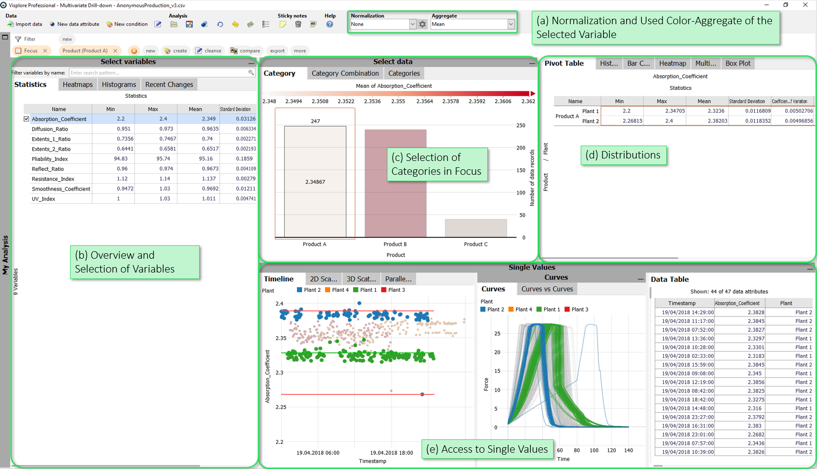
- Normalization and Used Color-Aggregate of the Selected Variable: Here, you can optionally normalize the variables for the analysis (e.g. z-standardization). Moreover, you can select the statistical summary that is color-coded per category in various views (like "Category (1 axis)").
- Overview and Selection of Variables: The views in this group show an overview of all variables, e.g. statistics, the distribution over categories, or histograms for each variable. Select variables in these views for a detailed inspection - all other views in the cockpit refer to the variable (or variables) selected here.
- Selection of Categories in Focus: These views can be used to define the focus of the analysis in terms of categories. By selecting categories, you can restrict the analysis to categories like a specific location or plant.
- Distributions: These views are the core of the cockpit. For example, here you can find a pivot table with statistics for each category / category combination ("Pivot Table"), a histogram or a view showing the box plots of the currently selected variable per category. All views in this group only show data entries that are in focus.
- Access to Single Values: This group of views allows access to single values. The "Timeline" view shows the currently selected variable including process borders and regions for existing target values, upper and lower tolerance limits.
Starting the cockpit - assigning semantic roles
The following roles can be given to data attibutes in this cockpit. Use the  icon in the toolbar to adjust them.
- Time axis: This role can be given to a data attribute defining a temporal ordering of the data records. Can be time stamps, or values. It will be used to define the temporal context for all variables, e.g. the times of measurement, consumption, production, etc. If the role is assigned to a data attribute of date/time type, periods like 'Month', 'Hour' etc. are extracted and available for defining filters, and categorical plots like bar charts.
- Category: Some views aggregate values by categories (e.g. per day of week, per month, etc.). When this role is assigned to a categorical data attribute, its categories are available for such aggregations. The role can also be assigned to numerical data attributes, which results in one category per distinct value of that attribute (e.g. different states encoded as 0 or 1). If the role is given to a data attribute of date/time type, periods like 'Month', 'Hour' etc. are extracted and available for defining filters, and categorical plots like bar charts.
- Variable: Numerical data attributes with this role can be inspected in the cockpit and are considered in calculations. In case you want to exclude a variable from all considerations, simply do not assign this role to it.
- Independent Variable: Data attributes with this role are independent variables whose influence on the numerical properties / KPIs is to be investigated. Example: Design parameters in a simulation or industrial process, hyperparameters for models, etc. Any number of numerical variables can have this role.
- Upper limit: A numerical data attribute with this role defines an upper limit for a variable. It will be shown along with the referenced data attribute in timeline views and histograms. Moreover, it is used in process statistics like tolerance violations.
- Lower limit: analogous to Upper limit, but for lower limits.
- Setpoint: analogous to Upper limit, but numerical data attributes with this role represent a setpoint (=desired state) for the reference data attribute. Data attributes with this role are additionally displayed in views.
- Curves: This optional role is for data attributes that hold one curve per data record, e.g. a short time series per production batch, or a spectrum
Selection of Variables
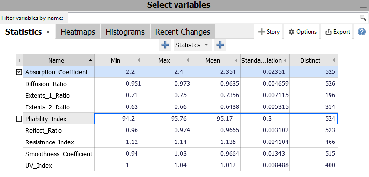
The views "Statistics", "Heatmaps", "Histograms" and "Recent changes" provide an overview of the variables available for the analysis (role "Variable"). Selecting a variable in one of these views means that all other views in the entire cockpit now refer to that variable. For example, the "Timeline" view now shows the time series of the selected variable.
Selection of Categories in Focus
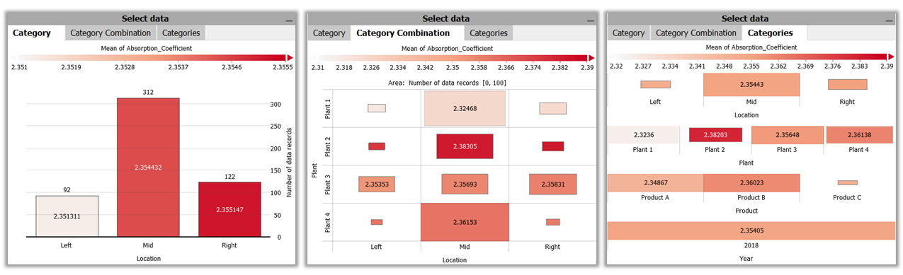
In the views "Category", "Category Combimation" and "Categories" you can obtain a summary of the values of the currently selected variable over categories in the data. The selected aggregation measure determines the color-coding of the views. If, for example, "Mean" is selected as a measure, the color of the areas shows the mean value of the measured variable for each category of one or multiple categorical data attributes. The categories by which the views are subdivided can be set via drop-down menus accessible via the corresponding axis labels.
These views are mainly used to select subsets of the data. This affects the rest of the views in the cockpit. For example, the calculations of the statistical values in the "KPI Statistics" view are restricted to the data of the selected cells of these views (i.e. of a specific category or category combination). Furthermore, the entries of the selected category are brought into focus in the "Timeline" view (in full color intensity), all other entries are displayed as context (grayed out). This allows you to view the individual values of the selected category (-combination) and their distribution over time.
Distributions
The views in this area form the core of the analysis. In contrast to the views in the "Selection of Categories" area, the views in this area are restricted to the focus. The views show detailed information on the currently focused data of the selected variable / variables. All other areas of the cockpit can be minimized to provide enough screen space for the views in this area. In this way, the data in focus can be viewed and analysed in detail under various aspects.
Statistics per Category
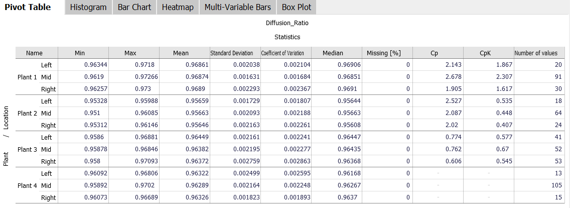
The "Pivot Table" view shows statistics for one or more selected variables, broken down by (combinations of) categories. The displayed statistics and subdivision levels can be freely configured by clicking the axis labels and '+' buttons next to them. The columns of the table can be rearranged using drag and drop. If you want to relate certain categories to one another, this view supports the display of relative aggregates (click the view title, then "absolute / relative results").
In the example above, a pivot table for the variable "Diffusion_Ratio" was created with a few clicks, which was subdivided on the Y-axis by "Plant" and "Location". A configured pivot table can be exported to the clipboard or a CSV file via the corresponding view options (click the view title, then "Data export") and then imported and further used in other programs such as Microsoft Excel.
Histogram
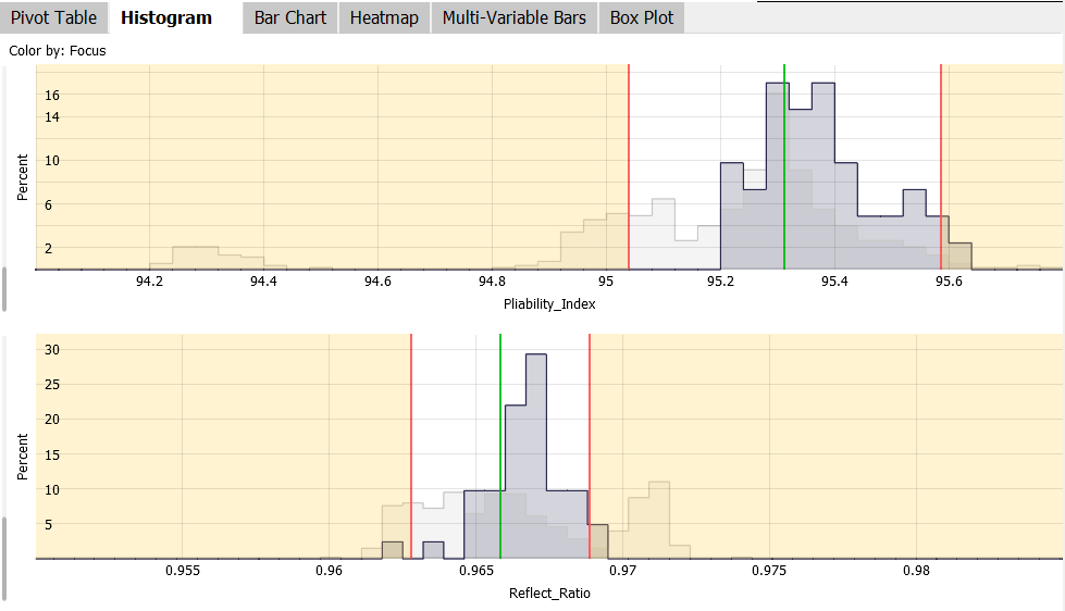
The "Histogram" view show the distribution of the values in focus for the selected variables using histograms. Additonally, all data records including those not in focus are shown as gray context (see image). If available, the histograms show tolerance limits and target values for the variables. The views further allow to display the normal distribution based on the mean value and standard deviation of the underlying values on top of each histogram in form of a black line (can be enabled in the menu when clicking the view title). Finally, the view can display statistical tests (t-test, chisquare-test) for the data in focus vs. the rest, or for categories (enable/disable in view title menu).
Bar Chart, Heatmap, Multi-Variable Bars
These three views basically offer a similar functionality as the views in the "Select data" section, but with one difference: they only show the data that is currently in focus. These views are particularly useful if, for example, you want to find out which categories or category combinations occur in an existing selection and how they are distributed.
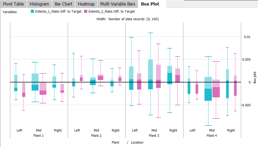
Box Plot
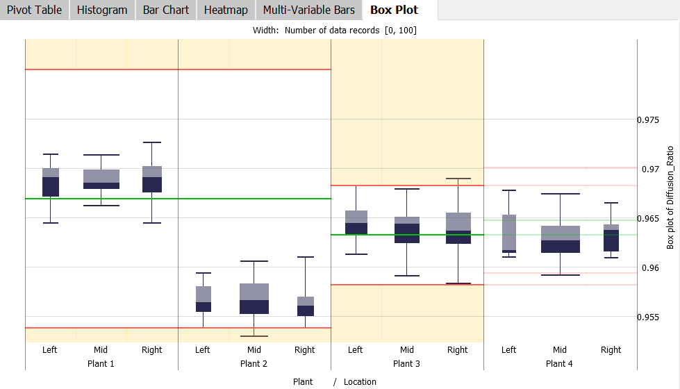
To analyze distributions of a variable by different categories, box plots for the selected variable are displayed in the "Box Plot" view. The subdivision by categories can be set as desired using the drop-down menus in the axis labels. In the example above, box plots are displayed for the measured variable "Diffusion_Ratio" per combination of "Plant" and "Location".
The width of the individual box plots results from the number of values in the corresponding category combination. To compare box plots of different variables, the view shows box plots of multiple selected variables side-by-side, distinguished by color:
Independent Parameters (perform input-output analyses)
When giving the role 'Independent Parameter' to some numerical variables, there are additional views of these independent parameters avaialble:
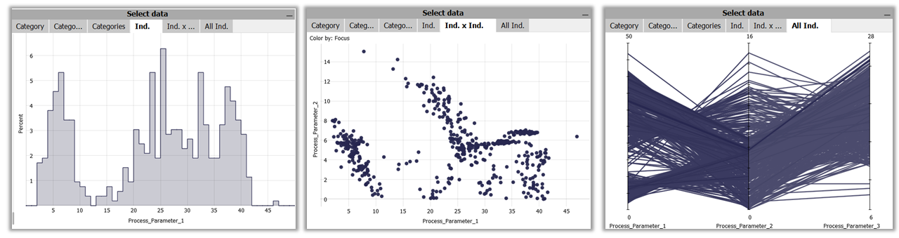
Selecting values for independent variables (as part of the 'Select' block)
- Ind.: A histogram of one selected independent variable, to select a value range. Select the displayed independent variable by clicking the axis label
- Ind. x Ind.: Scatterplot of two selected independent variables, to select combinations of values. Select the displayed independent variables by clicking the axis labels.
- All Ind.: A parellal coordinates plot of all independet variables, to select value ranges for multiple variables - . Axes can be re-ordered with drag and drop.
Dependent variables vs. independent variables (as part of the 'Single Values' block)
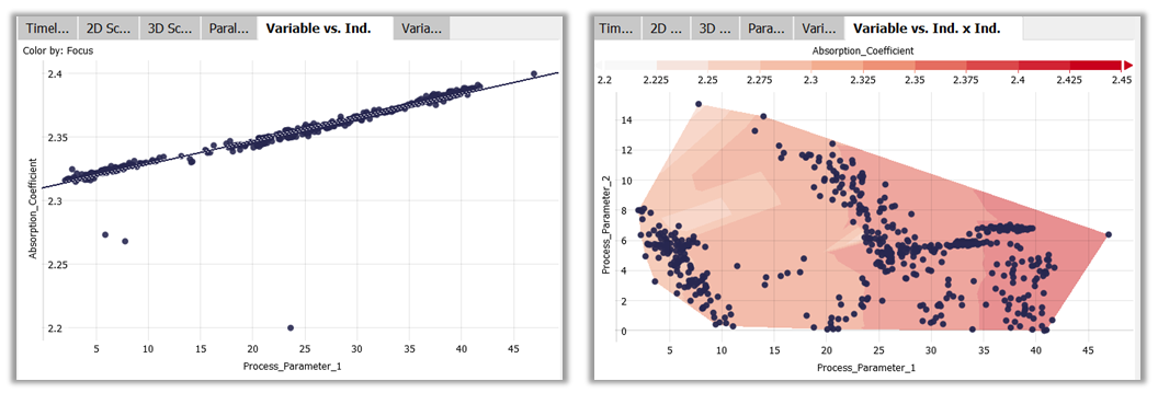
- KPI vs. Ind.: A scatterplot of the currently selected variables (selected in 'Select KPIs') on the y-axis, vs. one selected independent variable (select by clicking the x-axis label). Supports a sensitivity analysis of one or multiple objectives over one independent variable.
- KPI vs. Ind. x Ind.: Shows one selected variable (selected in 'Select KPIs') as colored backround over two independent variables (select by clicking the labels of x- and y-axis)
Access to Single Values
Timeline
The "Timeline" view displays the currently selected variable as a time series. The time series view offers the possibility to select and explore parts of a time series. If an area of a time series is selected, other representations in the cockpit are adapted to this subset of the data (see Selecting and Changing Intervals).
Timeline (stacked) and 2D Scatterplot
If two variables are selected in the cockpit, two further views appear next to the "Timeline" view: "Timeline (stacked)" and "2D Scatterplot". The first shows the two variables one above the other, the "2D Scatterplot" shows the two variables in two-dimensional space compared as a scatterplot.
Parallel Coordinates
If three or more variables are selected in the cockpit, the "Parallel Coordinates" view is shown:
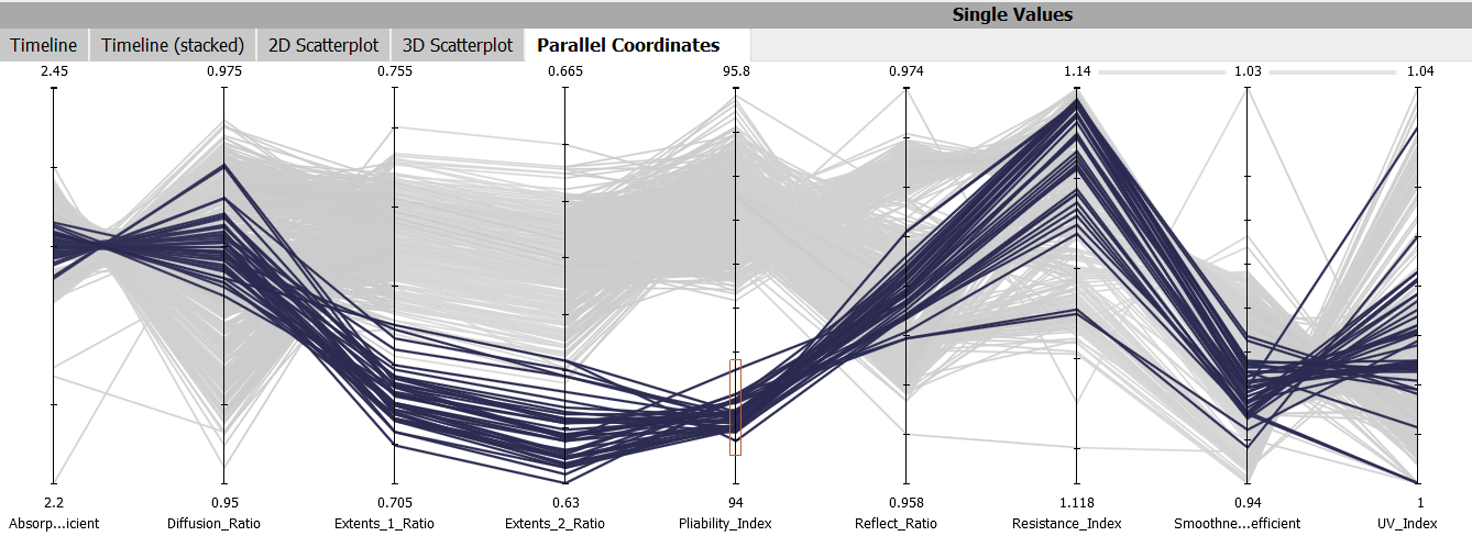
The "Parallel Coordinates" view compares selected measurement variables in a parallel arrangement. The horizontal lines between the two measured values each show a point (data line); the values of each line can be read from the parallel axes. The brighter the lines become, the fewer points are at the corresponding values. This allows you to determine in which areas values are located, at which points the most values are concentrated and to what extent the compared measured variables correlate.
You can select data rows in the value ranges of the parallel axes in this view. Selected rows remain in focus (full color intensity), all others fall into context (as gray background). You can then observe how the selected lines are distributed over other axes (and their value ranges).
Data Table
The "Data Table" view displays values of the currently selected data rows, including (if available) target values, upper and lower tolerances.