Adjusting the zoom level with the range slider
In most visualizations, you find a gray scrollbar near the edges to scroll and zoom, to adjust the visible part of the visualization.
In a time series view, click the gray horizontal scrollbar in the very bottom of the plot, to open this range slider control:
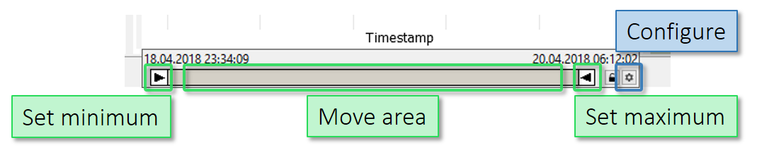
You can drag the white arrows inwards to zoom, and then move the viewed area by dragging the gray area between the white arrows.
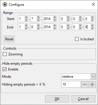
For specifying an exact time interval, click the gearwheel icon on the far right (see "Configure" in image above). After typing a date range such as 1.7.2014 to 1.8.2014, click OK to confirm.
In many cases, the visualized range is reset when you select another variable to be shown - for example, the "Time Series" or the "Histogram". To fix scales, use the lock symbol on the control element. This prevents the diagram from automatically adapting the scale when you select another variable.

These control elements and interactions are used in many places for adjusting scales. For example, the y-axis of the Time Series, but also in Histograms, 2D Scatter Plots, or also for long tabular views, like "Statistics", or "Heatmaps", etc. It therefore pays to practice their use a bit.