Comparing time periods
Many important analysis questions involve the comparison of data from two or multiple time periods. An example is finding root causes of process anomalies, by comparing anomalous periods to 'normal' periods. Another example is analyzing the effects of process changes, by comparing the period before the change to the period after the change.
Visplore supports defining the periods for comparison interactively and visualizes the compared data subsets in various ways (statistics, histograms, and much more). Moreover, built-in analytics support searching for variables where the compared periods differ a lot - speeding up root-cause analysis for large numbers of sensors significantly.
In this tutorial, you learn how to compare explicitly selected time periods.
Note: This section describes how you can select two or more intervals on a time axis to compare. If you want to compare all events where a variable has a certain condition like 'Temperature > 40', please refer to the chapter on 'Comparing events'. And if you have explicit categories in the data (like 'process step 1' and 'process step 2') to compare, see the chapter on 'Comparing categories'.
Preparation (to follow this lesson using demo data)
For the tutorial, load the solar power demo dataset from the welcome dialog, as shown below if you have not already done so.
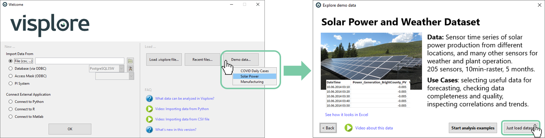
Confirm that you are in the Trends and Distributions cockpit. It will say so in the Visplore window title.
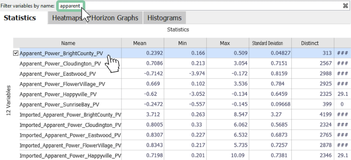
Select the 'Apparent Power Bright County PV' time series with a click. You can quickly find it by entering "apparent" in the filter above.
Selecting time periods for comparison
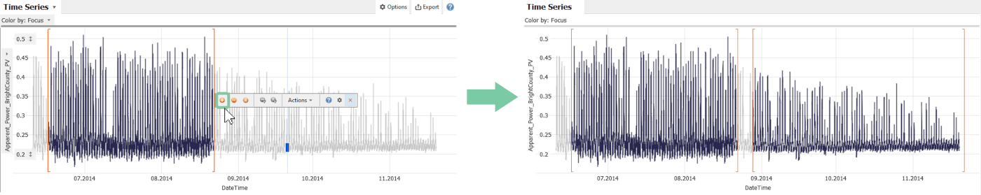
To compare two periods, choose the horizontal selection mode, as shown below.
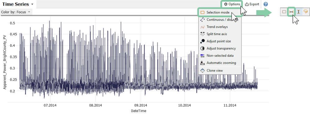
You can now select the first period, by pressing the left mouse button at the beginning of the first time period and moving it to the desired end. To select the second period, click on the '+'-symbol, as shown below, then again select the period as you did before.
To compare these selections, click on 'Action', then 'Compare', and finally 'Compare selections'. You can give the comparison a name, but this is optional.
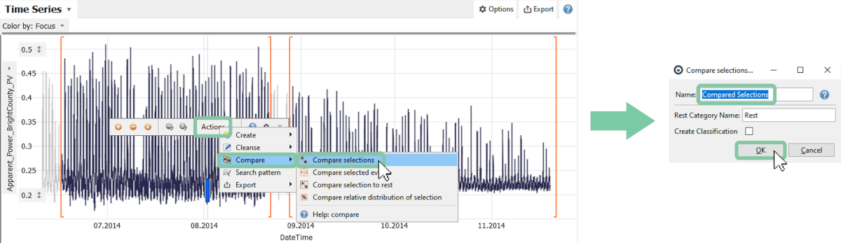
As a result, the views are re-configured to facilitate the comparison, e.g., by discriminating the selected segments using color or by subdividing axes. Everything but the compared data is temporarily filtered, and not shown:
The following sections describe how the visualizations support comparing the selected periods in different aspects.
Comparison via statistics
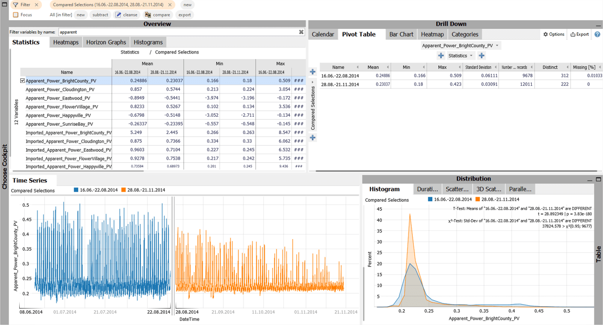
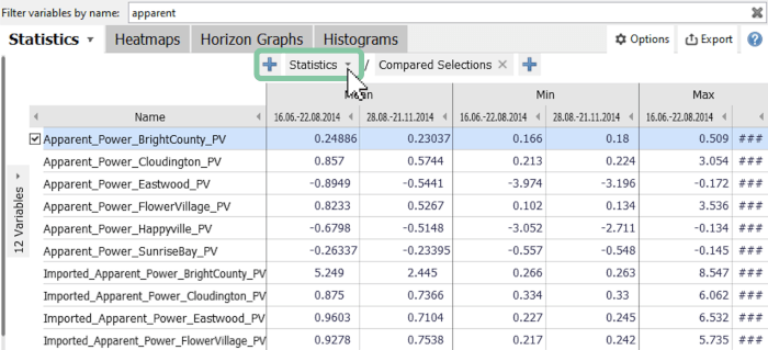
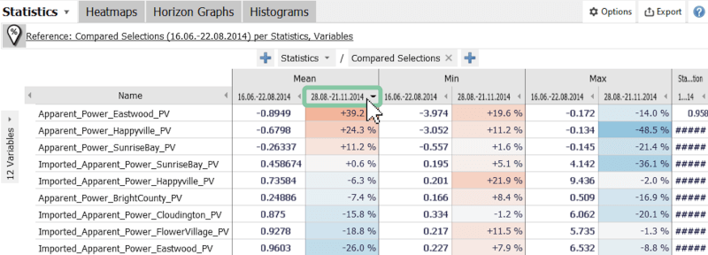
The image below shows the statistics (mean, minimum, maximum, etc), which are separately calculated for each period and compared. You can add or remove statistics as shown below.
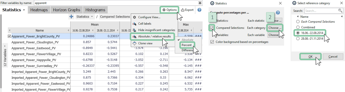
To better observe the change in the two time periods, it is useful to look at the percentage change of one period in reference to another.
Click 'Options', then 'Absolute/relative results' and select 'Percent'. Check the checkbox 'Compared selection' and choose the time period, that should be considered as the reference.
For each variable, you are now comparing the statistics of the second period with the statistics of the first period, which is represented in percent as seen below. By choosing this representation, it is easy to find out which variables change the most (or least) in these periods.
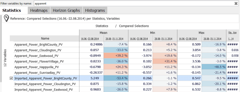
If you are interested to see which variables changed the most, it is helpful to sort the variables. This way you get the largest or smallest changes to the top.
Click on the preferred column to sort the variables (in this example the mean of the second period).
If you want to have an overview of many variables for one statistic (e.g. mean), use the heatmap view:
Click on the tab "Heatmaps" next to "Statistics".
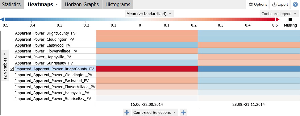
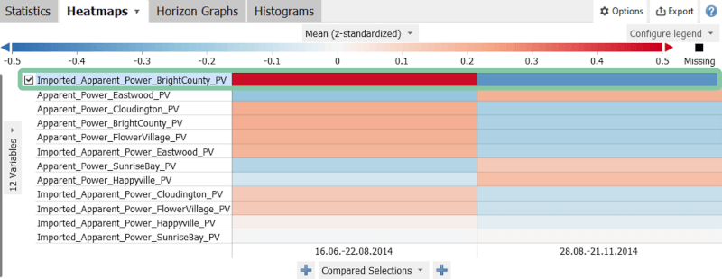
This is a condensed view that compares the time periods for many variables by using colors. By default, the colors show mean values of the variables - however, the variables are normalized by default, so that particularly large values (red) or particularly small values (blue) can be identified, regardless of the unit or scale of the variables. A white cell indicates a value that is similar to the overall mean value of both time periods combined. This allows you to observe which variables have changed a lot (strong color contrast between time periods) or which variables stay rather constant. (all periods rather white)
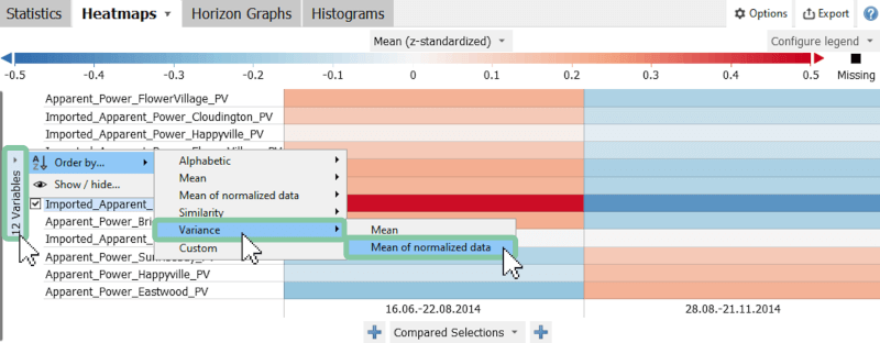
It is often helpful to order this list of variables by the variance of these means, in order to get those variables to the top, which change the most. The benefit of this view is the simplicity of the design, which also works very well when comparing more than two time periods.
Click on the variables icon on the left side, then 'Order by', then 'Variance', and finally 'Mean of normalized data'.
You will see that the apparent power in BrightCounty changed the most over the selected periods as it is sorted to the top.
Comparison via histogram and statistical tests
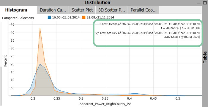
The comparison via a histogram serves to compare the distribution of the values of the different periods. As an example, the initial series 'Apparent_Power_BrightCounty_PV' is selected and displayed in the histogram below. Here both distributions are skewed and have mostly low values, but the blue one has also values up to 0.45 and also a slightly higher variance.
The histogram also provides a 'T-Test' and 'Χ2-Test' as highlighted in the image below. They are available when there are exactly two periods and can be disabled also ('Options' then 'Statistical tests'). These tests evaluate if the mean values of these two periods and the standard deviations are significantly different from each other.
Note: To better understand the functionality of the tests, please refer to the following sources: T-Test, Χ2-Test
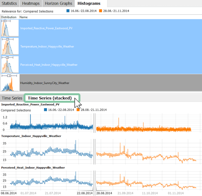
Comparison via histograms overview: finding out which variables changed most
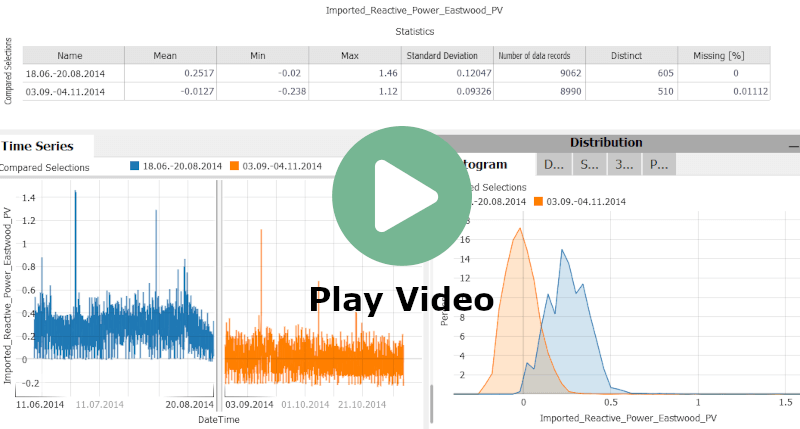
Use the histogram view in the overview section to see the value distribution for multiple variables. This view shows a list of all variables with a small image of a histogram for each category aside. The top-ranked variable is the one where the distribution is most different for the compared categories. This ranking is computed according to a mutual information measure (~ how overlapping / disjoint are the histograms for the time periods, or: how much information about belonging to either time period do you gain by knowing the value of the variable).
Click on the 'Histograms' tab in the 'Overview' panel and clear the variable filter to see all variables (by removing the input or clicking the 'x').
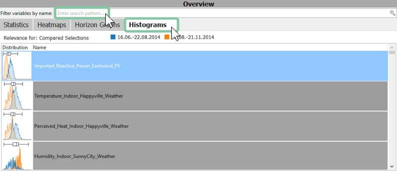
The image above shows that the imported reactive power in Eastwood and the indoor temperature in Happyville changed their value distribution most in those two periods (compare blue and orange distributions). In summary, this workflow may guide you towards potentially relevant variables for investigating, why a change between time periods happened.
Comparison via other views
The comparison of periods can be performed in any view that allows the use of categorical data attributes. The periods are then separated by colors or are used to subdivide rows or columns. Here are some examples:
Times series (stacked)
If you want to visualize multiple time series individually, you can use the stacked view.
Select multiple variables of interest by holding the control key while selecting variables in 'Histograms', or 'Statistics'. Then open the tab 'Time Series (stacked)'.
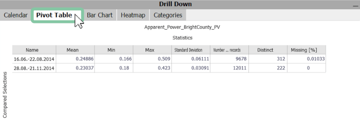
Pivot table
This visualization compares the statistical values of the periods for the selected variables. It is similar to the 'Statistics' tab in the overview, with the advantage, that both axis subdivisions, the statistics, and the choice of aggregated variables can be freely defined. For instance, you can subdivide the y-axis further within each compared time period, by clicking the plus symbol above/below 'Compared Selections'.
Click on 'Pivot Table' in the 'Drill Down' panel.
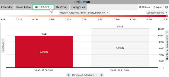
Bar chart
The bar chart view initially shows the durations/frequencies of the compared time periods. Furthermore, the mean value is visualized by the color by default. The statistic can be changed by clicking on 'Mean of Apparent_Power_BrightCounty_PV' and the 'Number of data records' can be changed also by clicking on it.
Click on the 'Bar Chart' tab in the 'Drill Down' panel.
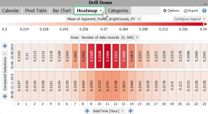
Heatmap
The heatmap view allows you to compare any cycles like weekdays or average daily cycles for compared selections (as shown in the image below). This feature is very useful for, e.g. the analysis of photovoltaic peak values.
Click on the 'Heatmap' tab in the 'Drill Down' panel.'
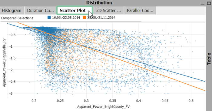
Scatter plot
The Scatter plot serves to identify correlations between two variables. While performing comparisons, the periods are displayed separately using colors. In this example (Apparent_Power_BrightCounty_PV and Apparent_Power_Happyville_PV), you see that there is one cluster with many values but little correlation between the two variables for both periods.
Click on the 'Scatter Plot' tab in the 'Distribution' panel.
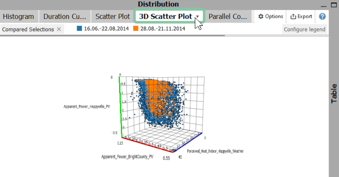
3D scatter plot
To display up to three variables in one scatter plot, you have the option to use a 3D scatter plot. Again, the compared periods are displayed separately using colors.
Click on the '3D Scatter Plot' tab in the 'Distribution' panel.
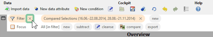
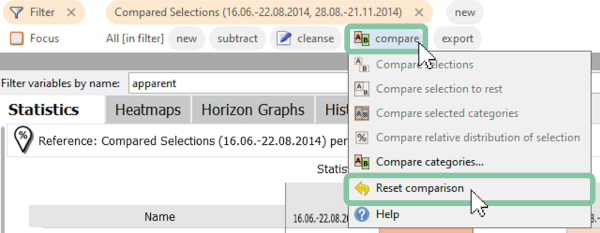
Reset the comparison
To reset the comparison, use one of two possibilities:
Remove the filter by clicking on the X, and then choosing to reset the comparison as well, when asked in the dialog.
Or: Click on 'compare', then 'Reset comparison'.
Useful tips for working with comparisons
Note: You are not limited to comparing only two periods, it can be any number of selections. The workflow is the same as described above, just select more than 2 time periods with the '+' icon inbetween.
Note: You are not limited to comparing time periods. Selections can be performed in many other views as well (e.g. select clusters in the scatter plot).
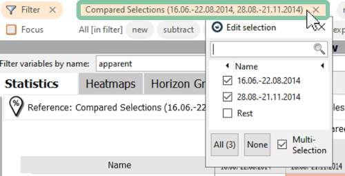
Note: If you are comparing multiple selections, you can display or remove individual categories in the filter bar (see image below).
Great! You have mastered the workflow for comparing time periods!
License Statement for the Photovoltaic and Weather dataset used for Screenshots:
"Contains public sector information licensed under the Open Government Licence v3.0."
Source of Dataset (in its original form): https://data.london.gov.uk/dataset/photovoltaic--pv--solar-panel-energy-generation-data
License: UK Open Government Licence OGL 3: http://www.nationalarchives.gov.uk/doc/open-government-licence/version/3/
Dataset was modified (e.g. columns renamed) for easier communication of Visplore USPs.