Data labeling in Visplore - USE CASE TUTORIAL
An important step of data preparation is to label (or annotate) parts of the data with semantic information. For example, labeling inexplicable anomalies in sensor time series allows for an efficient discussion with co-workers, or assessment by the data owners. Moreover, AI solutions for predicting anomalies require labeled training data for learning to distinguish impending problems from normal behaviour. In many cases, only the domain experts are familiar enough with the data to externalize this kind of knowledge in the form of labels, and need tool support to do the annotating efficiently.
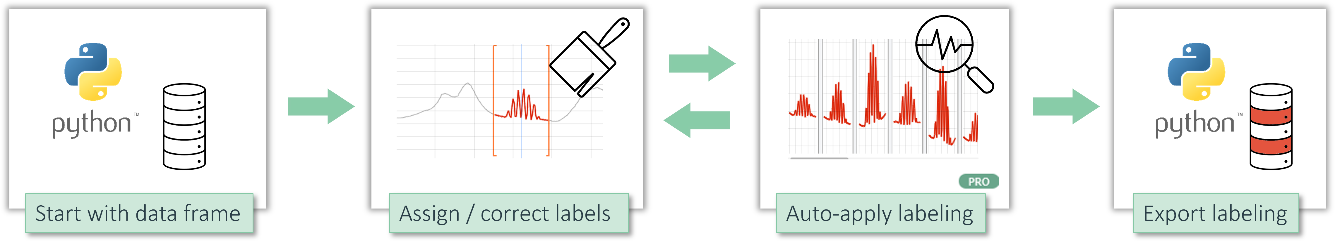
In this tutorial you learn how to label time series data interactively (much like painting the labels), as well as semi-automatically (algorithmic rule + manual correction). Moreover, we demonstrate how you can audit and correct existing labels. The tutorial starts from Python (but you can skip this when starting from another data source), and ends with exporting the labeling back to Python or CSV.
 Video available: An alternative way to get acquainted with the workflow is to watch this video tutorial. However, the tutorial text below is based on the Visplore demo data, so it's easier to replicate.
Part 1a) Start with data from Python
Skip this section if you don't work with Python (or R, or Matlab, which work analogously) - you can also load the demo dataset directly within Visplore as described in the alternative section below.
Many data science workflows start in environments like Python, R or Matlab, where data from any sources is gathered and represented as some kind of data frame. Here, we will use the demo dataset with solar power production and weather time series.
Preparation: If not the case yet, install the Python connector VisplorePy as described here.
In Python, load the openpv demo dataset as pandas dataframe, and send it to a new instance of Visplore:
import visplorepy


my_dataframe = visplorepy.load_demo_data('openpv')


visplore = visplorepy.start_visplore()


visplore.send_data(my_dataframe)
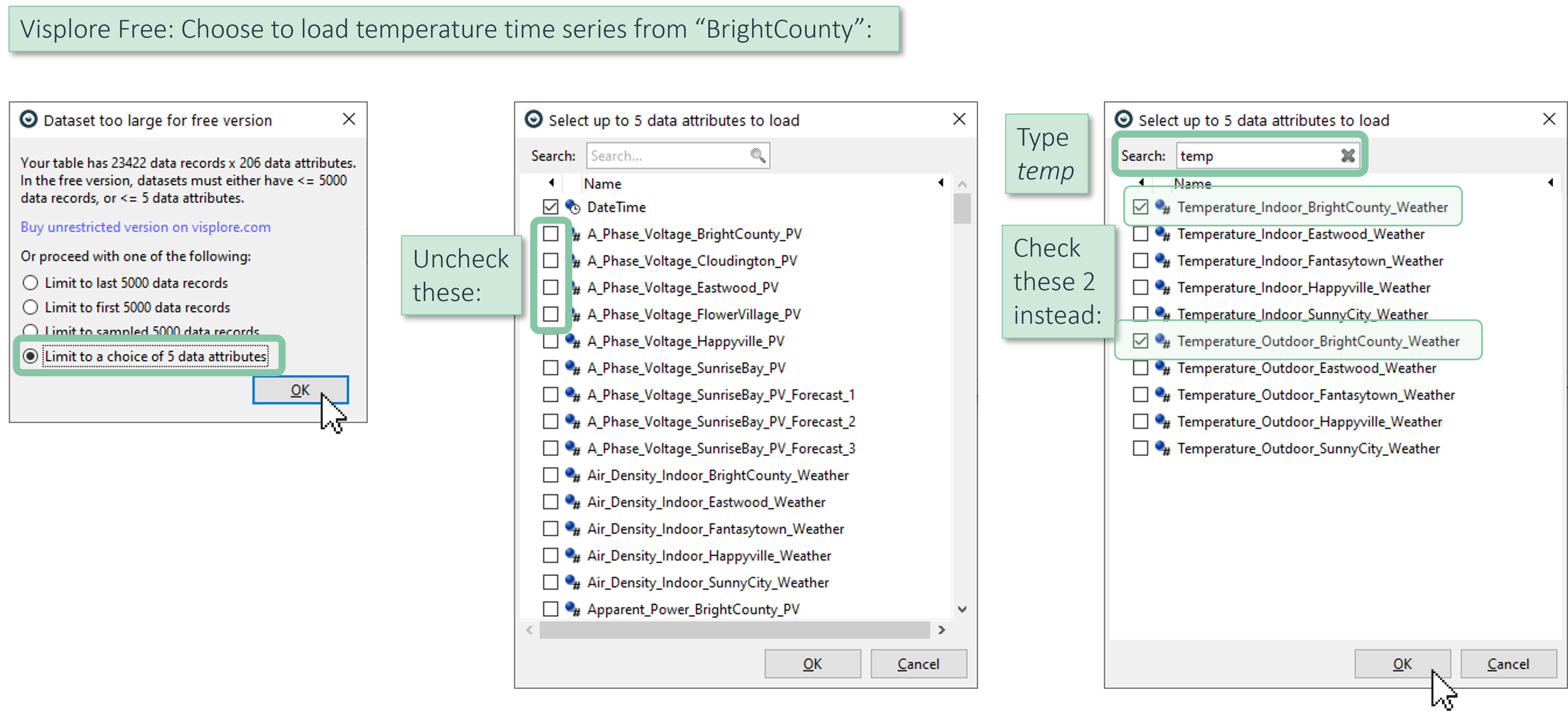
If you are using Visplore Free, you can not load all data attributes. Make sure to keep the Temperature time series from 'BrightCounty', as needed for this tutorial:
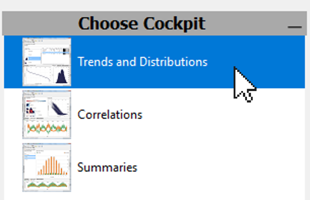
Any version: once the data is loaded, start the cockpit 'Trends and Distributions' with a double click. In case you see a dialog for role assignment (Pro), confirm it with OK. Then, the cockpit starts, and you're ready for Part 2.
Part 1b) (Alternative) Start with data from another source
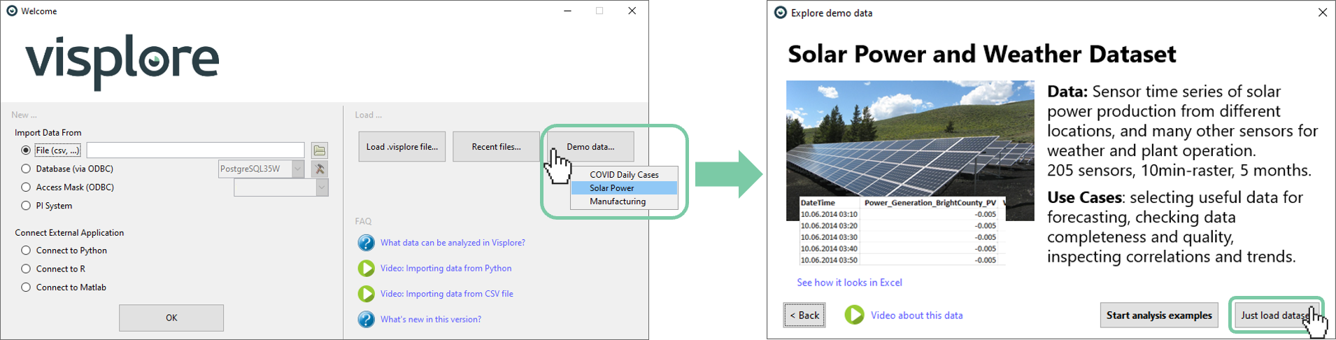
If you're not working with Python, you can start Visplore directly, and load your dataset from any other source (CSV,..).
For the tutorial, load the solar power demo dataset from the welcome dialog, as shown below.
Part 2) How can I assign labels manually?
This section shows you how to interactively assign labels to the data, much like painting the labels on data points.
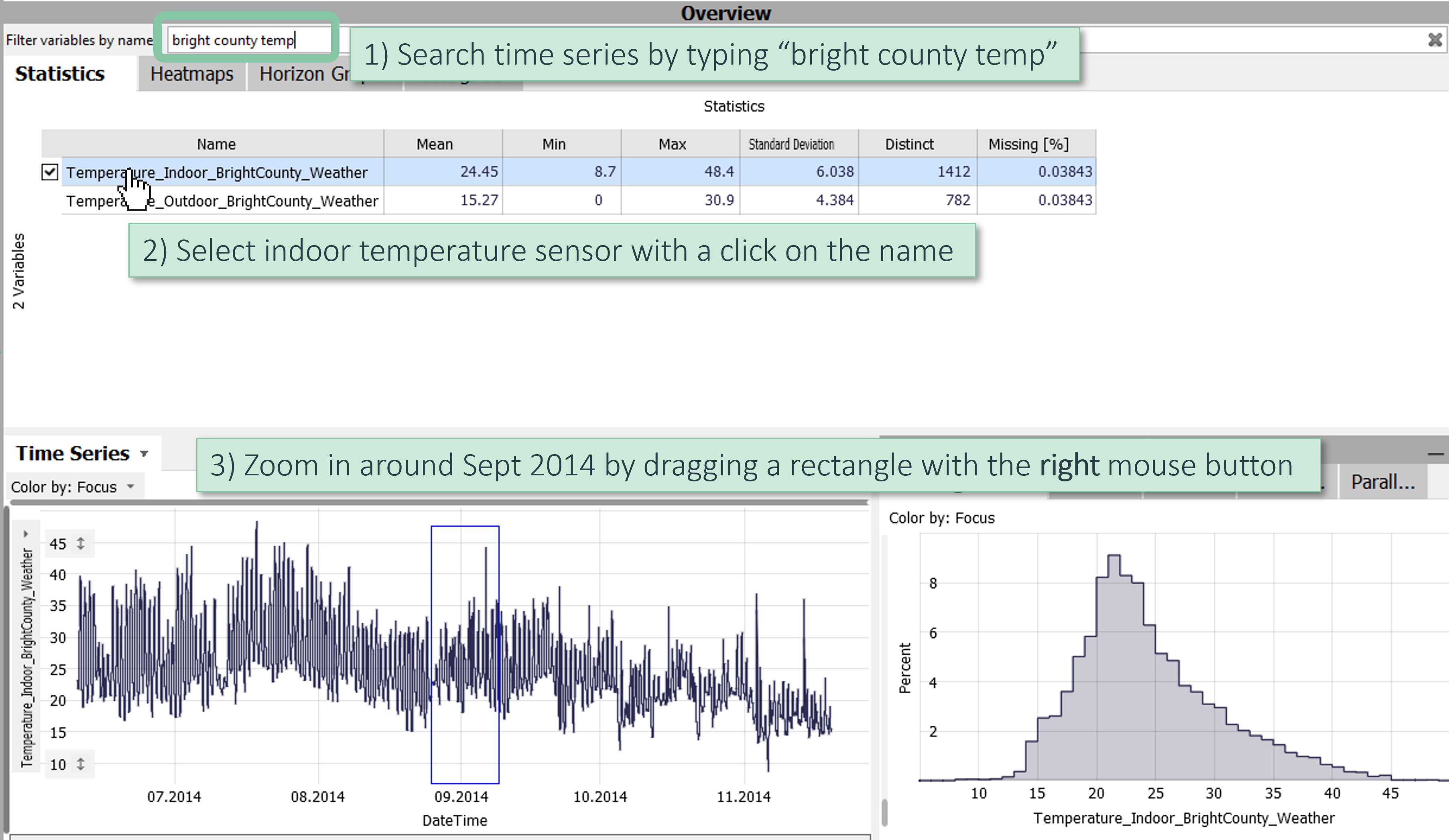
The dataset in this example contains almost 200 time series. Let's focus on a particular temperature sensor that is known to have had anomalies, and zoom in:
Note: if you accidentally zoomed in wrongly, you can zoom out again with this button in the bottom left of the time series view  , and try again.
Note: if you tried to zoom using the left mouse button instead of the right mouse button, you have made a data selection. You can clear that again by pressing the X here: ![]() - then try again.
- then try again.
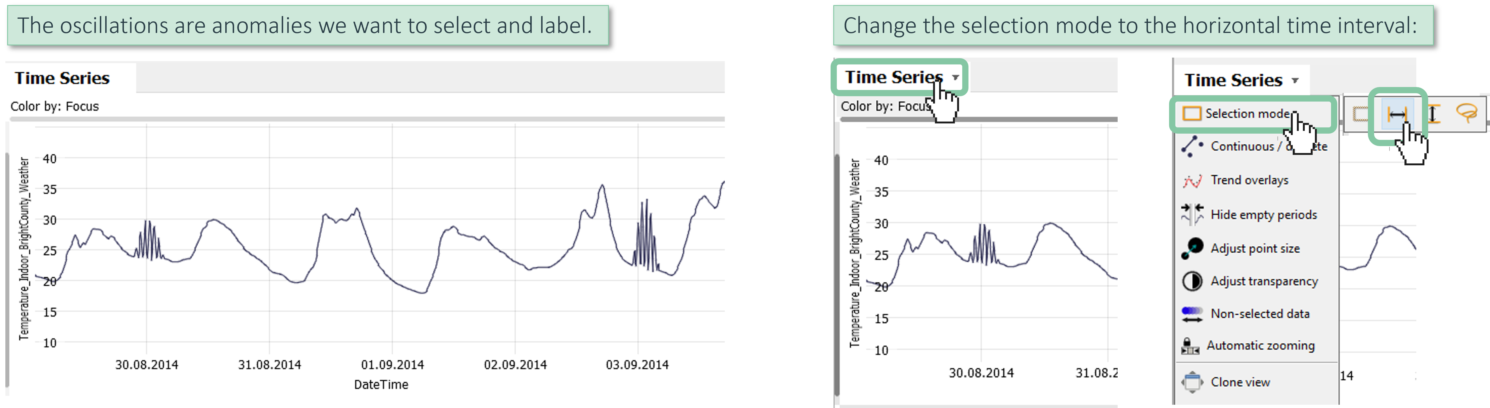
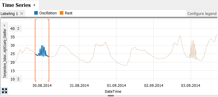
Once you have zoomed in to September, you can see the anomalies: some unplausible oscillations of the temperature. Let's select the horizontal interval selection tool, so we can label these times:
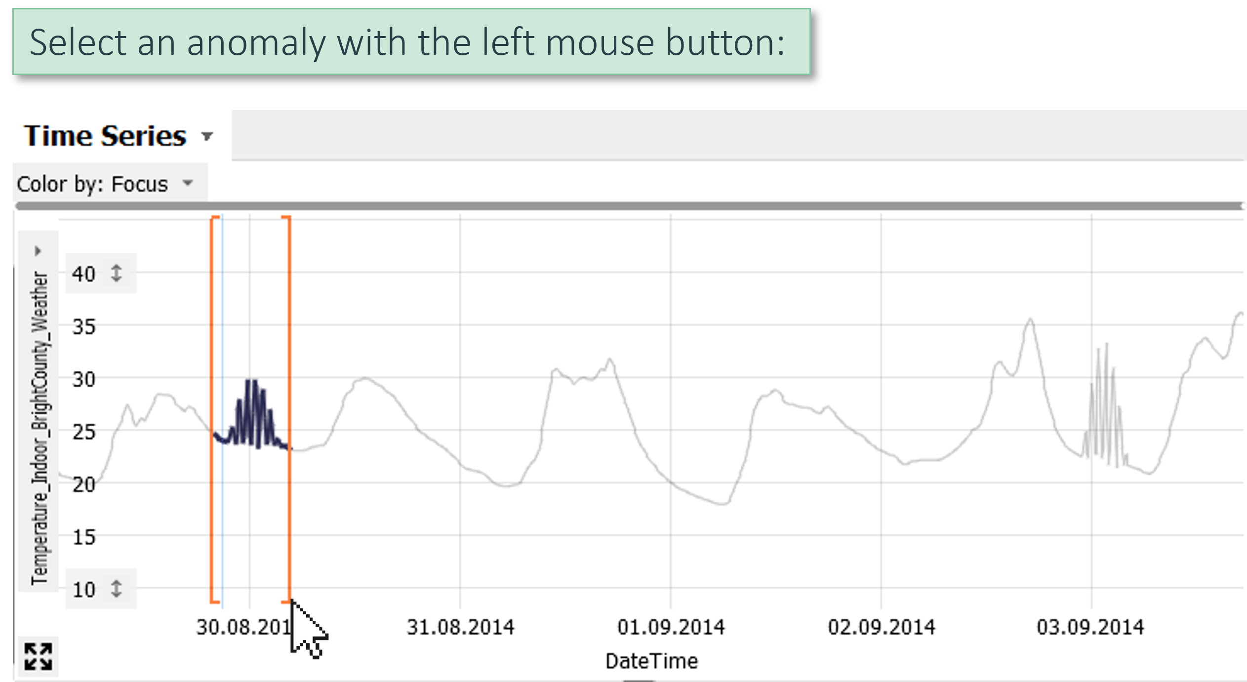
With this selection tool, select the first of the anomalies by dragging the left mouse button:
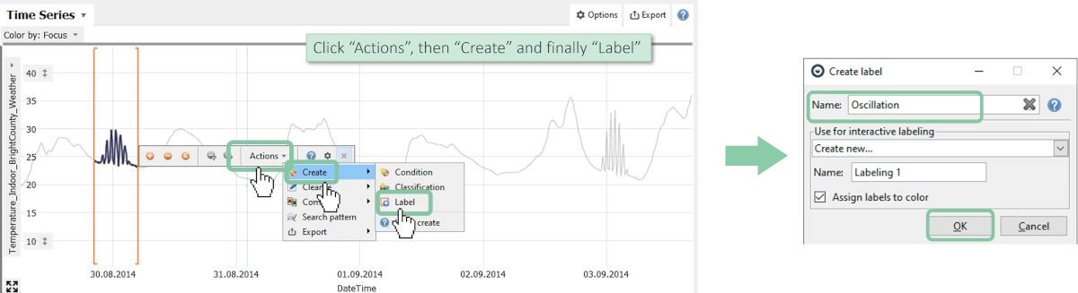
Now you can give this selection a name to start labeling. Name it "Oscillation":
Now you are in a labeling mode, where your labels are shown using colors. You can label further periods by selecting, and clicking the button "Oscillation":
Great! You have mastered the basic workflow for manual data labeling. There are several ways you can continue from here:
You can scroll through the time series (e.g. using the mouse wheel or the scrollbar) and label further occurrences.
You can also create new labels within the labeling, e.g. for other types of anomaly or any other semantics, by pressing the "New" button next to the "Oscillation" button after selecting data
You may also select and label data in many other views, such as the Scatter Plot, or the Histogram. And use any selection tool you want, like the Lasso, or the vertical selection brush, etc.
Note that the labeling functionality shown so far works for all versions of Visplore, including the Free version.
Part 3) How can I assign labels (semi-)automatically? Pro
In Visplore Professional, there is a shortcut that significantly speeds up the process of labeling multiple occurences of a pattern in a time series at once: Pattern Search.
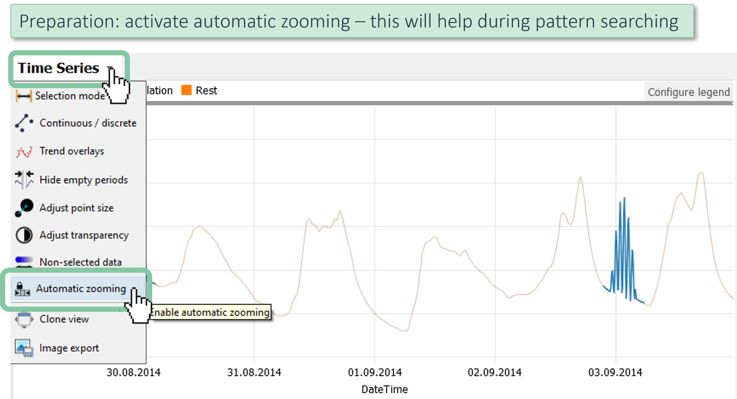
First, as a preparation step, enable the Automatic zooming feature in the Time Series view. This will make searching for patterns much easier:
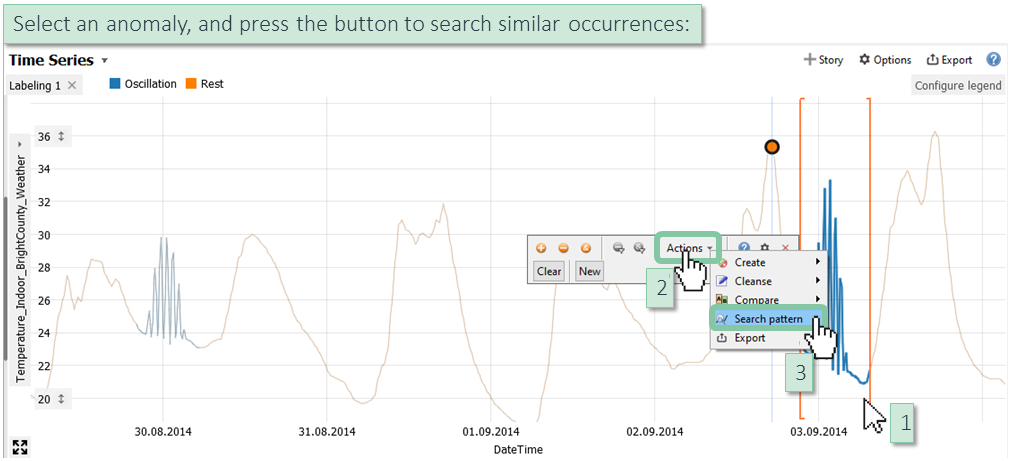
Now, select an oscillation pattern with the left mouse button, and press the search button to begin searching for similar occurrences:
This opens a dialog, where you adjust the search parameters. In our example, patterns should be found regardless of the level (value on Y-axis) they osciallate around, and regardless of how strong the oscillation is (extents of pattern on Y-axis), so you can set the options accordingly. Also, we need to define a threshold for how similar the pattern must be, in order to be found:
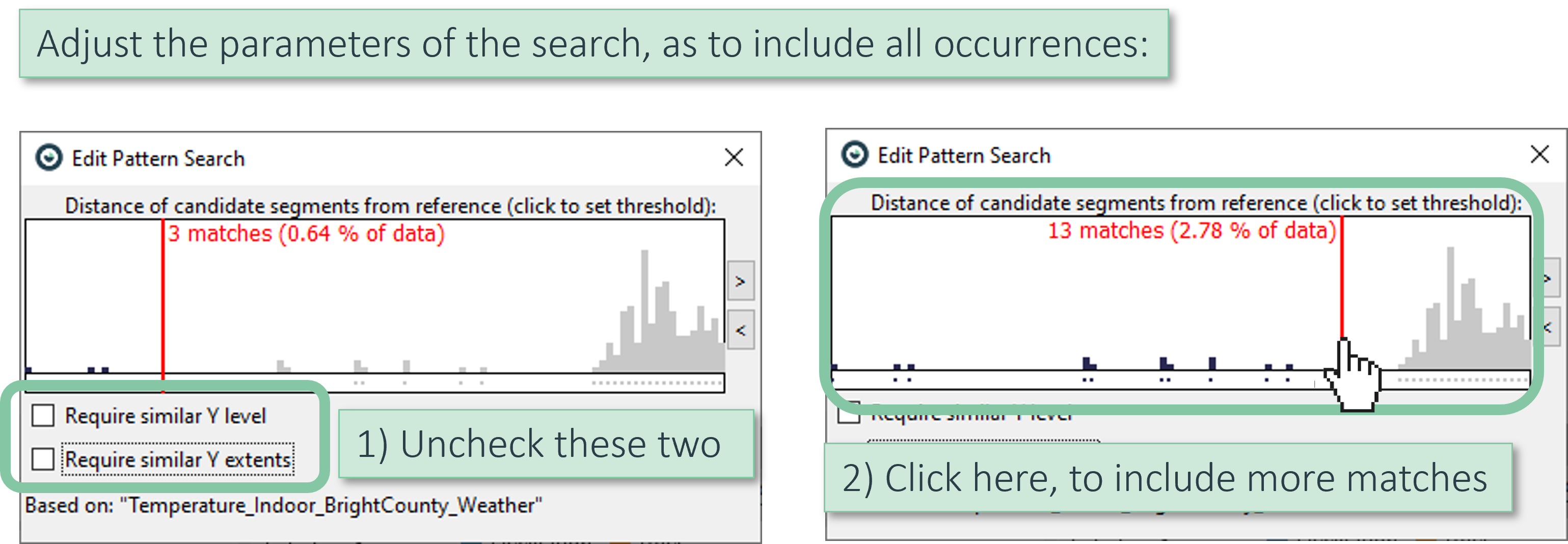
Thanks to the automatic zooming we enabled before, the time series view zooms to show all found occurrences at once (see image below).
Note how the zooming and highlighting of occurrences immediately adapts, when you adjust parameters of the search in the dialog (e.g. click to set the red threshold line to something else.).
When you're satisfied with the search, close the dialog. (You can get the dialog back later by clicking the orange button  )
)
After closing the search dialog, validate the search occurrences by zooming in with the right mouse button:
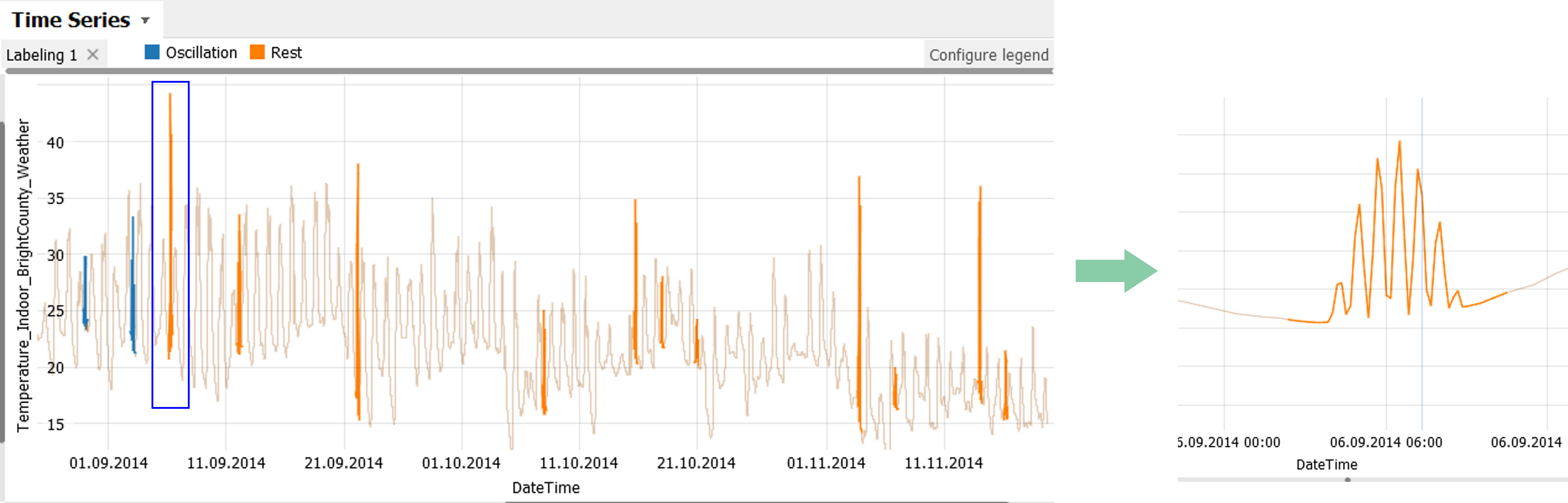
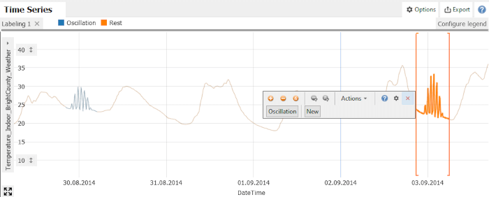
Zoom out , and finally, label the occurrences selected by our search as Oscillations. Follow the image below. The result should be that all occurences get the color of the label.
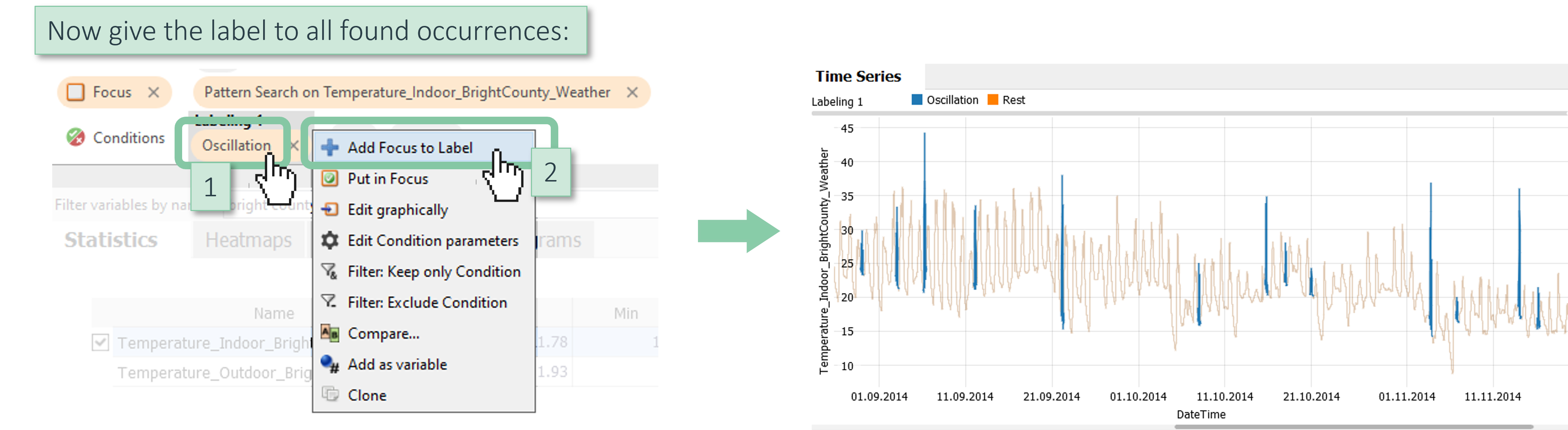
Note: With "Add Focus to Label" you can give the label to any selection, not only searched patterns. Also in cases where the simple labeling button "Oscillation" we've used in Part 2 is not shown.
Optionally, you can adjust the visualization as not to include anything that is currently not in Focus - which allows you to plot all occurrences nicely next to each other:
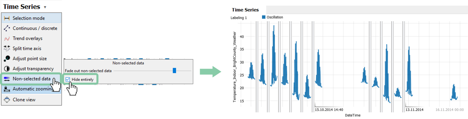
Tip: Use the “Split time axis” feature in the menu above, and drag the slider to the right, to collapse all gaps between occurrences.
Finally, you may sometimes need to manually correct the labels given by automatic search.
For this, it makes sense to show the non-selected data parts again. In case you followed the previous image, and tried hiding them, please disable the "Hide entirely" checkbox again, to see the entire time series again.
Then, zoom in to an oscillation (drag right mouse button), and select the time period you want to remove the label from (drag left mouse button). Finally, click "Clear" to remove the label from the selection:
In the same way, you can also change a label to another one, by clicking the name of the label instead of "Clear".
Great! You have mastered the basic workflow for labeling automatically by pattern searching!
Part 4) How to export labels to Python or CSV
This section describes how you get the result of your labeling out of Visplore for further tasks. First, various ways of exporting are listed, then exporting to Python is described in more detail.
Note: Labels refer to entire data records (= table rows), not just to the values of the particular variable you labeled. This becomes evident when looking at the Table View, which you find in the bottom right of the screen.
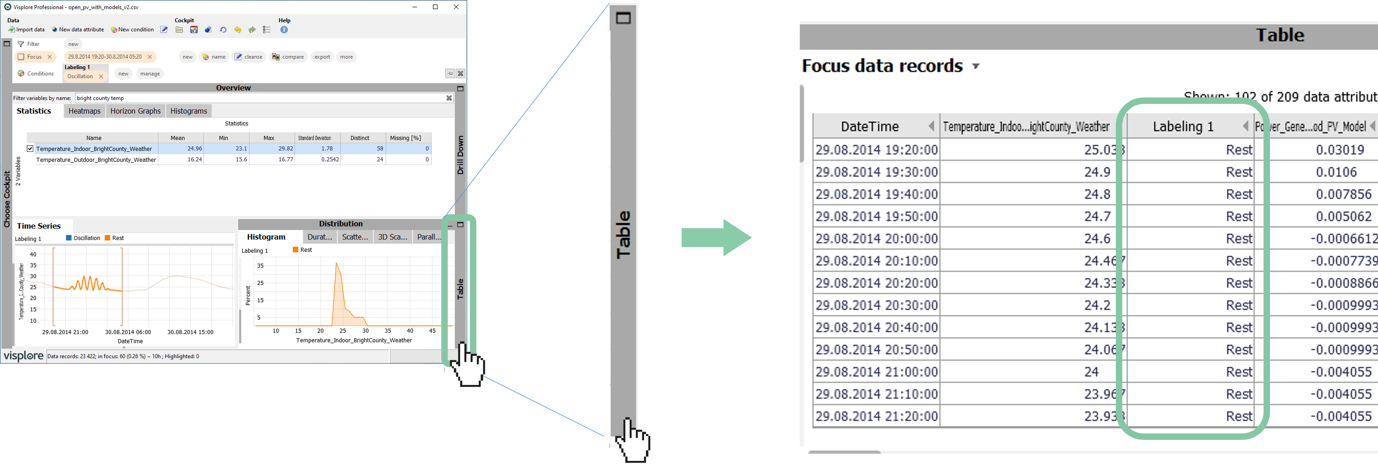
There are multiple ways of exporting the labels for further use:
- Exporting the table view as shown in the image above. For this, ensure the "Table" tab is opened, then click the view title "Focus data records", and
 . This exports the table exactly as currently shown, to CSV or clipboard.
You can adjust which columns are shown by clicking the view title "Focus data records", then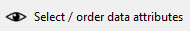 .
.
Note that the view only considers data records that are currently in Focus. If you want to export all data records, clear the Focus first by pressing the X in this button:
- Without going through this view, you can always export all data records in focus in different formats using the
 button in the Focus bar, as described here. This includes the labeling columns.
 - And finally, you can get back the labelings to Python and other external script environments as described in the following.
Getting the labelings to Python
If you have started your usecase from Python, or connected to a Python environment by this point (see here), you can use the following API commands to retrieve the labels from Python.
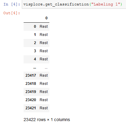
get_classification(name): retrieves the labeling with the given name as categorical data column of a new data frame.
visplore.get_classification("Labeling 1")


# you may need to adjust the name of the labeling, if you named it differently
In Jupyter, for example, the result would look like this (containing "Rest" where no label was added, otherwise the name of your labels, like "Oscillation").
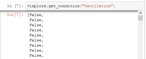
get_condition(name): Alternatively, this gets individual labels (like "Oscillation") that are part of a labeling, as a list of Boolean values (with True = part of the label, False = not part of the label):
visplore.get_condition("Oscillation")


# you may need to adjust the name of label, if you named it differently
In Jupyter, for example, the result would look like this. The length of the list corresponds to the dataframe in Visplore. Somewhere in the middle, the list has 'True'-values where the oscillations were marked in Visplore:
Great! You have successfully got your labelings out of Visplore for follow-up tasks!
Part 5) How can I apply a labeling automatically to new data? Pro
In Visplore Disovery and Professional, you can save configurations as templates in the form of a visplore file. For labelings you've made using rules like pattern searching, value intervals etc., visplore files can serve as templates to re-apply the labeling rules later to new data. For example, when you get next month's dataframe and want to find oscillations again without re-doing all the steps.
Before saving the visplore file, please do these preparation steps:
clear the Focus if not already the case, by pressing X here ![]()
zoom out in the Time Series view, if not already done, by clicking .
close a few views, by clicking their dark gray headers, e.g. here 
Then, when Visplore looks similar to the following image, save the file:
(1) Press the Save icon to store a visplore file. In the dialog, make sure the checkboxes are un-checked (2). This will produce a template that only contains user-created things like the labeling, but not the data source as such. Specify a file name (3), and confirm by pressing OK (4).

Next, we want to simulate loading new data (e.g. the data of next month), and applying our labeling rule to it. As we don't really have a different dataset at this point, we can do a clean loading of the same dataset, and then apply the template we just saved. The workflow is the same for real new datasets.
Close Visplore.
If you started the whole usecase from Python, go back to Python. From there, start Visplore again and send over the demo data as described in Part 1a.
Otherwise, if you started from the demo data in the welcome dialog, or your own dataset, start Visplore and load it again that same way (see Part 1b).
Now, when Visplore looks similar to the left image below (you don't actually have to load a cockpit), load the file as shown in the following.
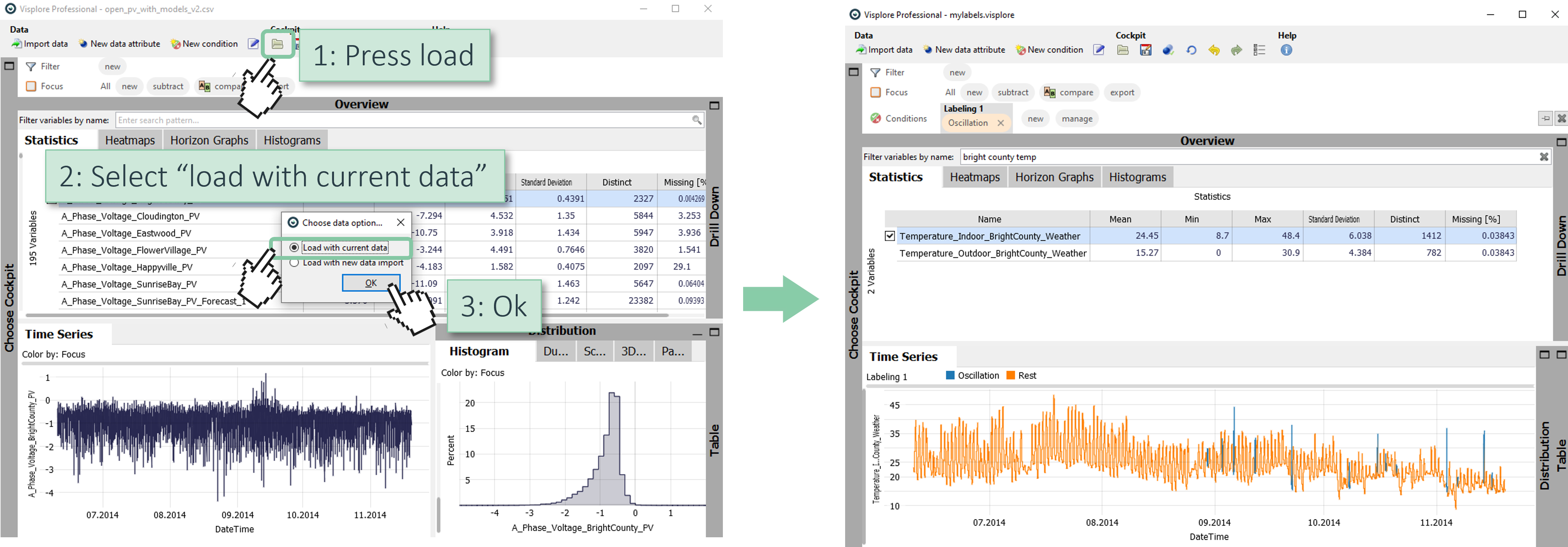
Note how the labeling has been re-applied. The oscillation pattern was searched again, and the time series are visualized in colors, as before. The same would also have worked if you really had used new, different data values (however, the data column names should be the same for a template to be applicable).
With the use of visplore files, the Python API allows to automate the labeling to quite some extent. For example, you could write a Python script/notebook that queries the most recent data from a source, send it to Visplore (send_data()), apply a labeling rule via template (load_session()), retrieve the labels (get_classification()), or export some images (get_image()) - all without any user interaction necessary. See the Python API documentation for more information on the API commands.
Part 6) How can I audit and correct existing labels?
Just as important as the initial labeling is the usecase of inspecting and correcting a labeling that was made by somebody else, or an external algorithm. Visplore supports a workflow of auditing and correcting any categorical data attribute - in particular, ones that contain labels. Regardless if the categorical attribute was already part of the originally loaded dataset, or it is merged to the Visplore data table at runtime from Python, R, or Matlab (see the send_data() command with "merge" in the Python API documentation).
In our example, we use a labeling that states Wind Directions for each time stamp of wind speed sensor measurements. The problem in this example is that for weak wind speeds, the Wind direction label is not reliable enough for using it in a follow-up algorithm. Thus, we want to correct the labels for weak wind speeds to an "unspecified" state.
Reload the demo dataset, including the Wind timeseries we need, by clicking  on top of the screen.
Then, select the demo data as follows:
After the cockpit starts, search and select the time series Wind_Speed_BrightCounty_Weather as shown below.
If you want, collapse the Histogram view by a click on the dark gray heading "Distribution" - to have more space for the time series view.
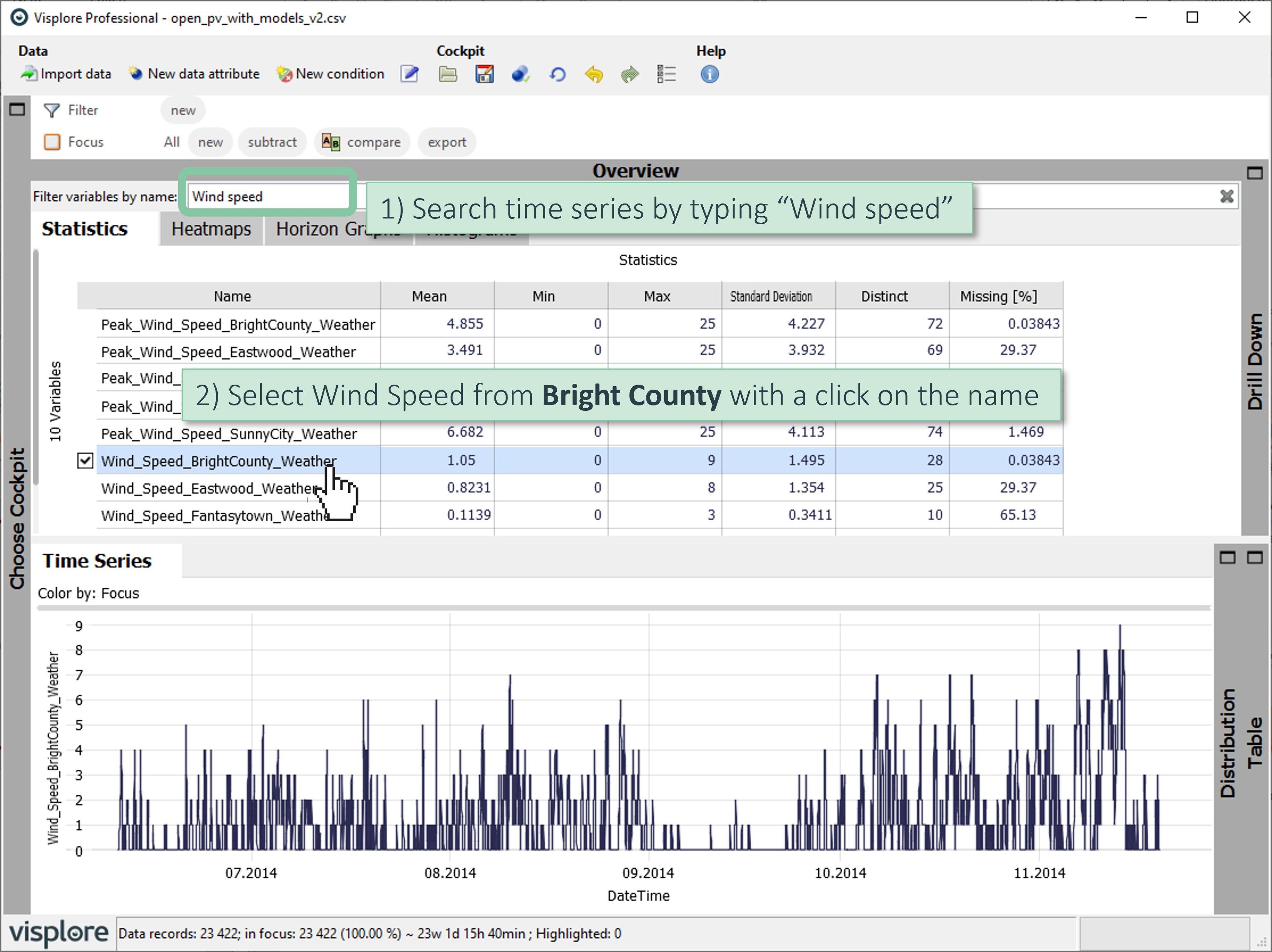
Now you see the Wind Speed time series in the "Time Series" view. The labeling we want to audit are the corresponding Wind Direction measurements.
Start auditing the existing categorical data attribute Wind_Direction_BrightCounty_Weather as shown in the following:
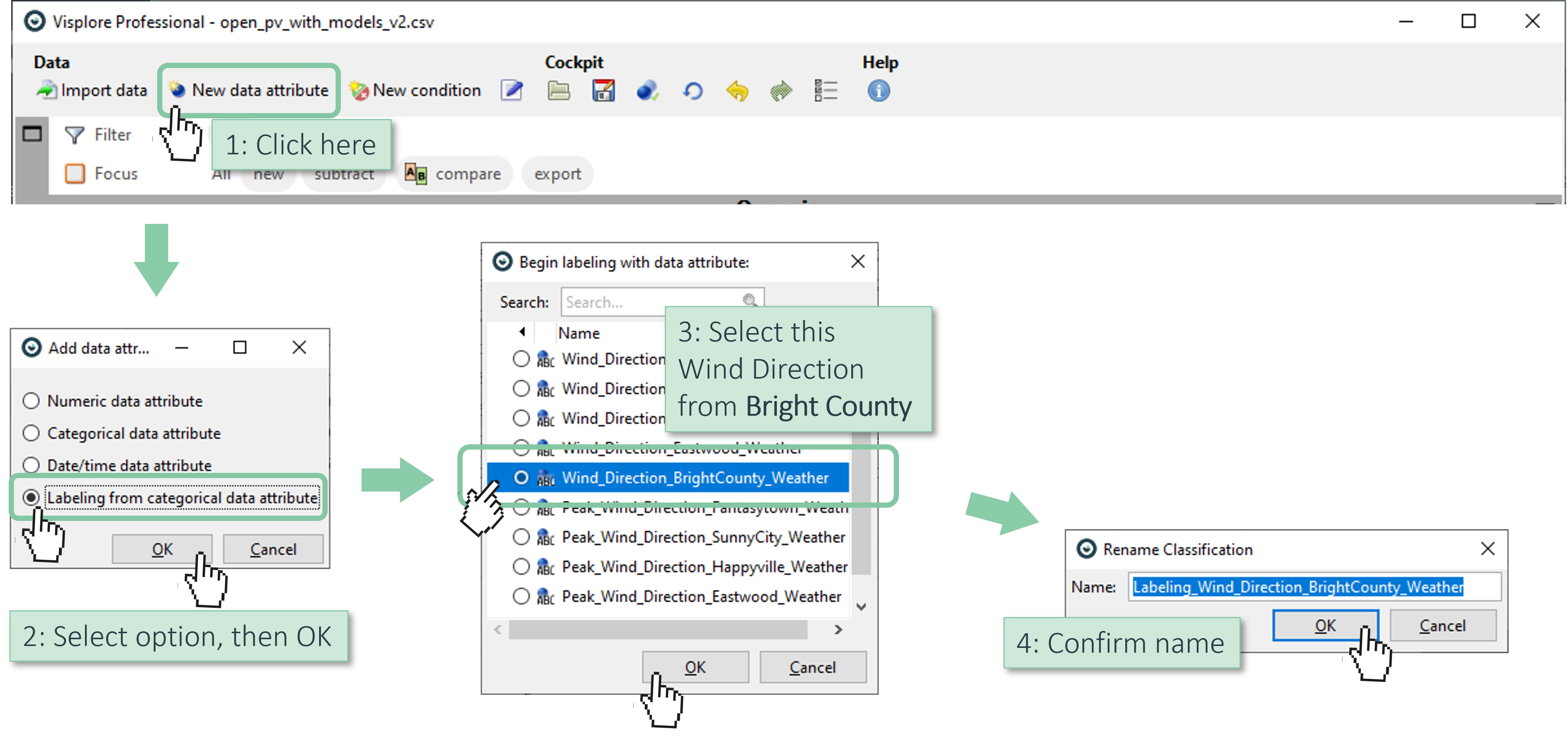
As a result, a new, editable labeling is created based on the selected original categories. The time series plot shows it in colors, and you are now in the same Labeling mode as in part 2 of this tutorial:
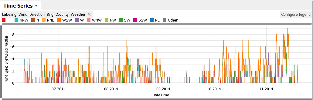
You can also audit the distribution of the labels.
Open the Drill-Down views, and configure the Bar Chart as to show the distribution of the new labeling:
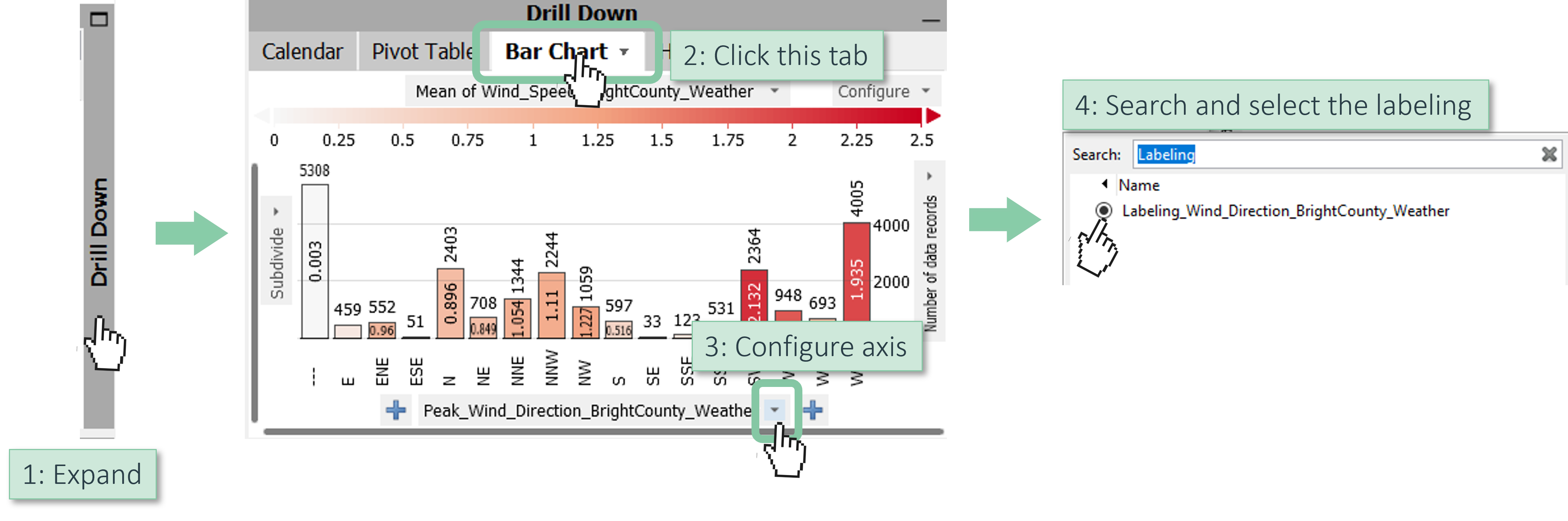
Then, the bar chart shows how often each Wind direction label has occurred (bar length). As the views are linked, you can easily see when no Wind direction was recorded; this is the label called "---".
Hover the "---" label to see the corresponding points in the time series:
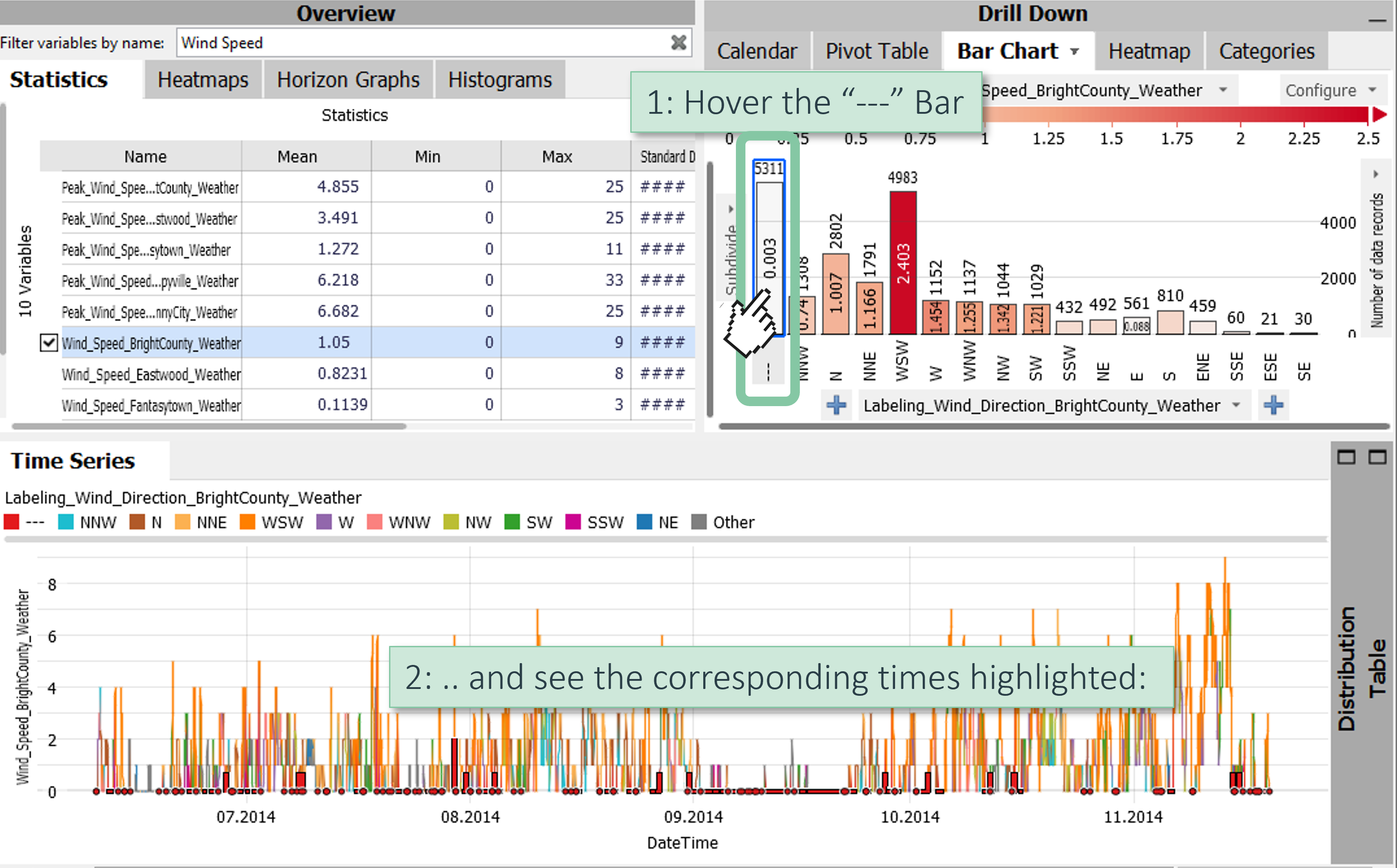
We see, that these are mainly time periods with Wind Speed around zero. For our imaginary follow-up application, we only want very reliable direction measurements, and change the labels to be "---" also for all speeds below 2 m/s. For this, we can simply select these periods, and re-label them as shown in previous parts.
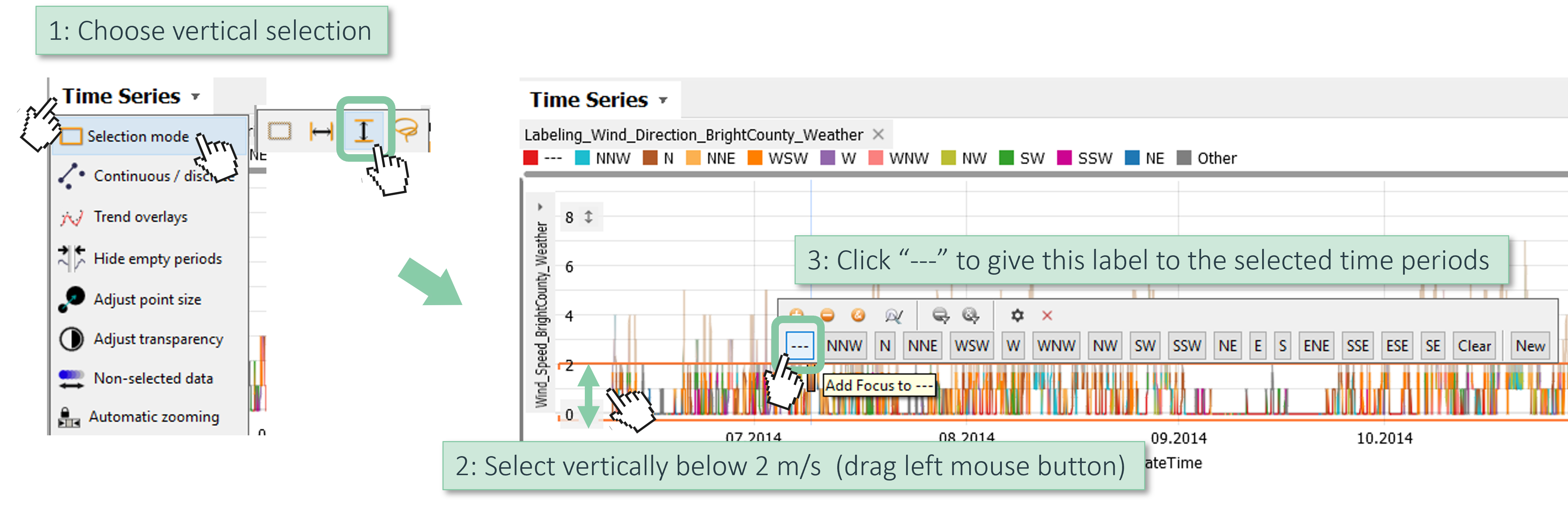
Use the vertical selection tool to select all times below 2 m/s, then click the "---" button to label all these times as undefined wind direction:
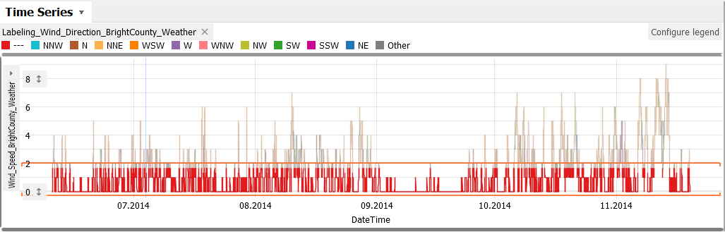
Now, all weaker time periods are labeled as "---".
Note that our selection was not very exact, but roughly below 2 m/s. If you wanted to make it exact, you could have clicked this icon in the Focus bar 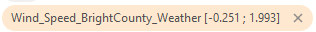 and set the borders exactly to 0 and 2.
From here, there are multiple directions to go forward:
- You can do further corrections. For example, re-label time periods, or merge certain categories like N, NNW and NNE by selecting them in the "Bar Chart", and re-labeling them as N, for example.
- When you're done, export the corrected labeling as shown in part 4.
Great! You have mastered the workflow for auditing and correcting labelings, and exported them for follow-up tasks.
License Statement for the Photovoltaic and Weather dataset used for Screenshots:
"Contains public sector information licensed under the Open Government Licence v3.0."
Source of Dataset (in its original form): https://data.london.gov.uk/dataset/photovoltaic--pv--solar-panel-energy-generation-data
License: UK Open Government Licence OGL 3: http://www.nationalarchives.gov.uk/doc/open-government-licence/version/3/
Dataset was modified (e.g. columns renamed) for easier communication of Visplore USPs.